FOREUP MARKETING
ForeUp is a cloud SaaS solution that provides golf courses everything they need to operate their business. From Point of Sale and reporting to marketing and everything in between, ForeUp is revolutionalizing golf course management. This is the story of how I improved the usability and aesthetics of their email marketing module.
Note: These designs were part of an audit and concept only recommendations. I had no control over when and if these designs were implemented.
INTRO
My Role
I was contracted in March of 2016 to improve the usability of ForeUp's email marketing solution. There were concerns with the overall flow, usability, and aesthetic design. I was tasked with providing recommendations and initial design mockups of what I would do to improve the product.
Product Team of 1
I worked closely with the CEO and CTO as my principal contacts/stake holders. While I prefer to work more collaboratively with a broader team, this was a constraint I was given to operate under. During the 4 week project, I was granted 3 in-person meeting sessions to present my work and gather feedback/approval.
Aggressive Timeline
As this was a consultant project, I was given 4 weeks to come up with recommendations and designs. This required me to streamline the process and really cut back to the bare essentials while still ensuring I was solve the business need AND actual user pain points.
Product Research & Design
I fulfilled the role of both product management and design. I researched the competition, identified main areas of opportunity, outlined the vision, designed a solution, and validated via usability tests.
THE CHALLENGE
Discoverable & Professional
ForeUp's primary customer base are small to mid-size golf courses with a course manager who handles virtually all aspects of managing the course personally. One other key attribute is that typically they have little experience with marketing. As such a simple user experience was key.
3 MAIN GOALS
1
Simple
The interface had to be easy to use, requiring little to no time to learn.
2
Professional
All emails sent out via the builder should be aesthetically pleasing & professional.
3
One-Stop Shop
All aspects of an email marketing campaign should be handled within the product. No outside software should be needed to plan, create, edit, send, or track an email campaign. This was vital to the brand promise.
THE APPROACH
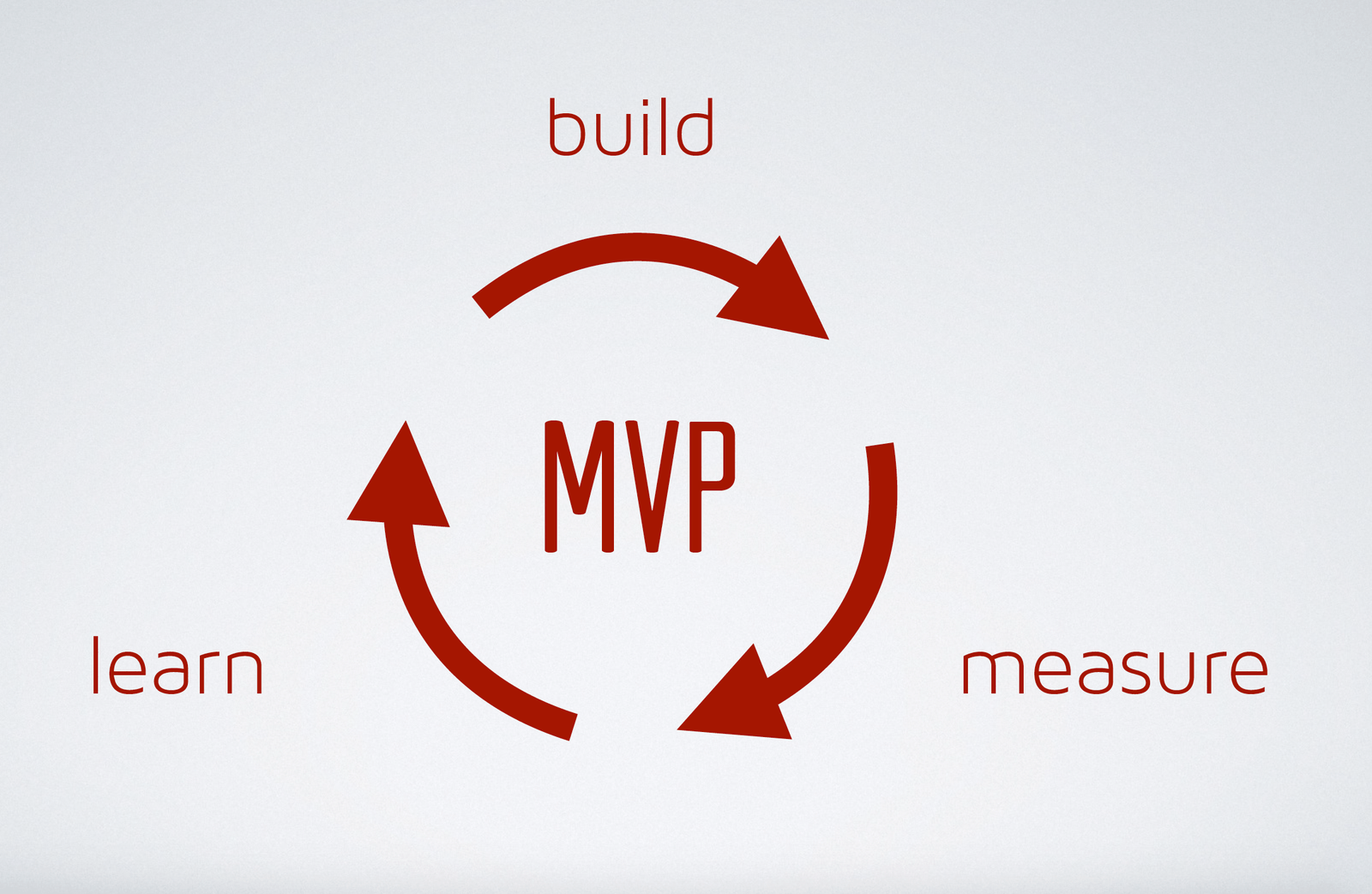
Learn Quickly
Although I was a product team of 1, I still recognized the importance of validating assumptions with research, keeping the whole user journey in mind, solve major problems with IA tools before jumping to wireframes and iterating quickly with multiple options. To achieve this, I followed a Lean UX approach. Identifying something I wanted to learn, taking my best guess, validating with research, and then iterating.
THE DISCOVERY
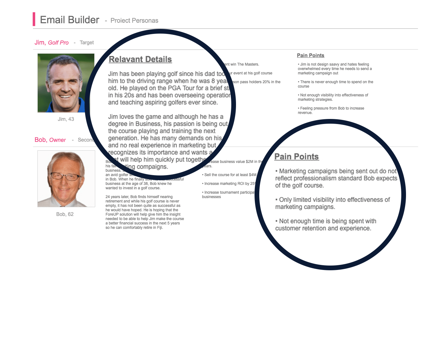
What Makes a Golf Pro?
While I had been given an overview, I wanted to really understand the user, and their pain points. To start I created personas for both the Golf Course Manager (target persona) and their boss. Due to the short timeline, the client was hesitant to set up interviews with actual customers, so I did the next best thing. I called up a couple local golf course managers (who incidentally ended up being foreup customers). I then made some small tweaks to the personas.
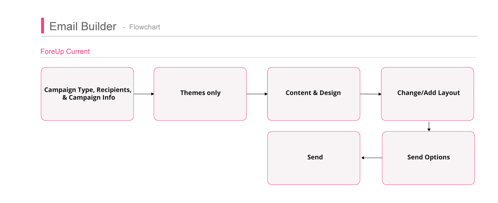
Current Flow
After validating my assumptions, I diagrammed out the current user flow to build an e-marketing campaign. This helped me understand the process from a high level and identify some gaps and key opportunities to provide a better experience.
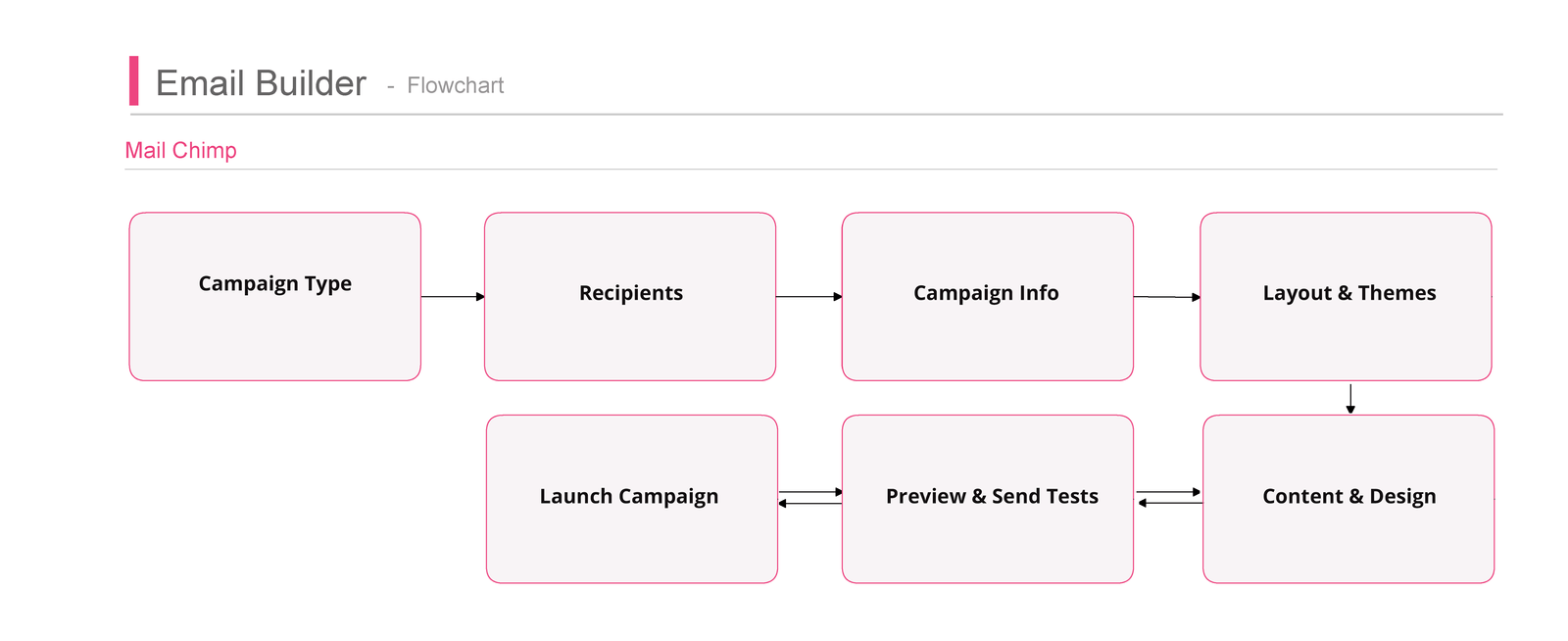
Competitor Flow
With the current ForeUp flow in mind, I wanted to get an idea of how that compared to the competition so I diagrammed out MailChimp's flow. There were some key advantages, but overall I was surprised by the gaps in usability that existed from such a big competitor. I began to see opportunities for real competitive advantage.
Empathy Through Journey Mapping
With the ground work laid, I began to identify some key areas of improvement. Using my research, personas, and flows as a guide, I created an Empathy Journey Map to better understand how a user might be feeling while trying to build an email keeping the bigger picture in mind.

Improvements to Flow
From there I had a pretty good idea where the pain points were and was able to start to define key areas for improvement. I started to define some of these and after collaborating with my stakeholders, was able to diagram these out on a flowchart.

THE VISION
Professional Responsive Design Made Easy
With all the ground work laid, I was able to define the vision for the enhancements and recommendations for improvement. I created a vision board clearly outlining the results of all the research and information architecture. From it, stakeholders would be able to understand the priorities for the project, user needs we were solving, target user groups, business needs this would meet, constraints we would have to operate under, and high level product features.
RECOMMENDED IMPROVEMENTS
Design Before Recipients
I found that asking a user to enter recipients before the email design has been completed is disruptive to their flow, does not follow their mental model, and can cause irritation. One key enhancement was to ask users for a recipient list after the design is completed and their mind turns to preparint to send the email.
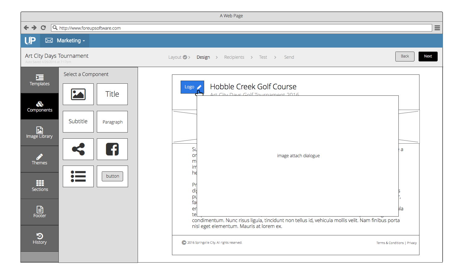
Components & Tools
Components and tools were lumped together in the current design. They need to be separated so the user's brain can compartmentalize them as separate kinds of elements which will lead to being able to find them easier and thus cause less cognitive load (eliminating frustration).
Color Themes
I found that asking a user to enter recipients before the email design has been completed is disruptive to their flow, does not follow their mental model, and can cause irritation. One key enhancement was to ask users for a recipient list after the design is completed and their mind turns to preparing to send the email.
Sections
In order to enhance the ease of use and also provide for more granular and usable templates, I added a library of ``sections`` that could be saved and used across templates. These were things like headers, footers, specific blocks of content (i.e. tournament invite, billing reminders, etc) and were configurable in 1, 2, 3, or 4 columns.
Preview Mode
One of the biggest frustrations in the old email builder was there was no preview mode to see how the email would look on different screen widths and email clients. This dramatically draws out both frustration and time to complete the task. Even though it is somewhat costly from a development perspective, I strongly recommended adding this feature.
Test Email
Similarly, the old version had no way to send a test email to double check everything was working as intended before launching the campaign to customers. This was another area of recommendation.
Navigation Breadcrumb
As a key interaction enhancement, I added a breadcrumb navigation that served the dual purpose of providing feedback to the user of where they were at in the process as well as provide an easy way to switch between parts of the process if needed.
Dynamic Templates
After setting a template initially, there was no way to switch templates except to back out and start completely over with a new template. Even recognizing that it would require some development effort to achieve, it was vital that we make this more dynamic. So if you change your might half way through or a particular template is not working out, the user could swap templates and their content, images, etc would remain intact.
DESIGN JOURNEY
Quick & Iterative Design
Doing all the work upfront to understand, and define the problem saved a lot of time when it came to design. I utilized Balsamiq to wireframe different options and then met with the ForeUp stakeholders to get feedback and choose a final design direction. This process went smoothly because we had already solved the core usability problems and so were able to focus on micro interactions and how we wanted everything laid out.
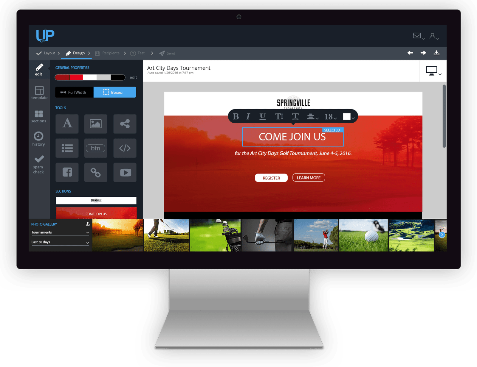
Final Design
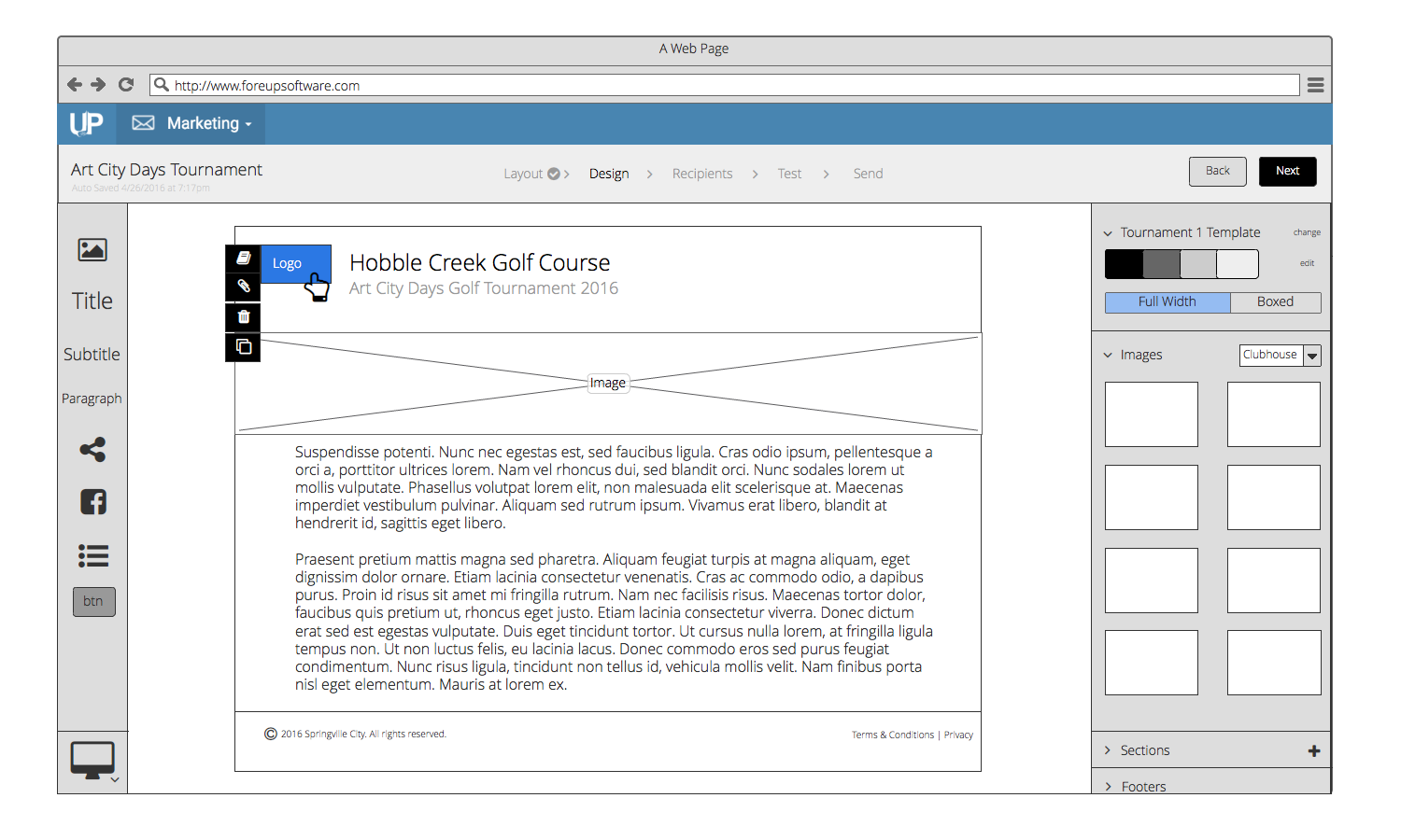
After receiving feedback from my stake holders and conducting some quick paper usability tests with a couple users, I moved on to high fidelity design. I made an effort to stay true to the existing branding while still pushing the aesthetic ball forward. I also ended up eliminating some parts of the existing interface that were too much for the target user (HTML WYSIWYG mode for example). This helped simplify and create an excellent experience for the user.
REFLECTIONS
Constraints
I am really proud of where this project ended up considering I only had 4 weeks to get it done and was given very limited support from the client in terms of access to users and collaborators. If I had it to do over again, I would push a little harder to get access to actual users and at least a developer or two to collaborate with that understands the entire platform better than I did. I would also encourage the key stakeholders to observe the research and testing.
Overall, though, I felt the project went well and will definitely increase customer loyalty and retention.
CONNECT WITH ME:
© Copyright 2017 Jeremy Bird Design - All rights reserved.