Reducing creation time of referee eligibility requirements by 5000%
Information Architecture Revamp & Migration Strategic Plan
ArbiterSports builds sports management software to help the NCAA and other sports associations and governing bodies to find, schedule, retain, and pay officials and other event workers.
This is the story of how I brought stakeholders into my process, and how, together, we created a multi-year strategic plan to combine 7 disparate products into 1 seamless user experience for our customers. We also designed and built the first phase of this plan, which reduced Eligibility set up time by 5,000% and was a major contributing factor in landing the 2nd biggest deal in company history.
SITUATION
Combining 7 disparate products into 1 seamless experience
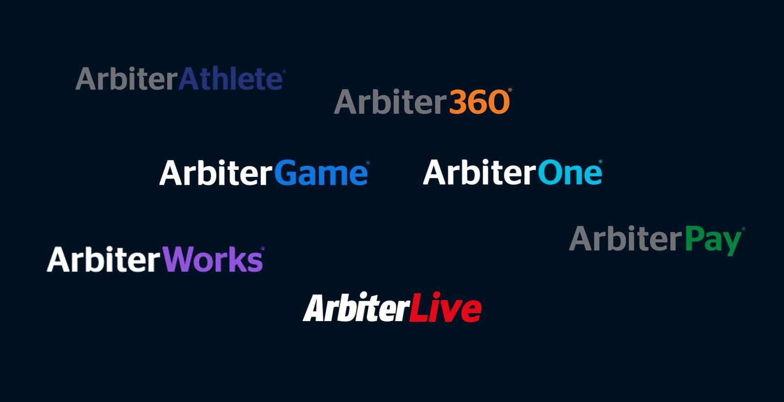
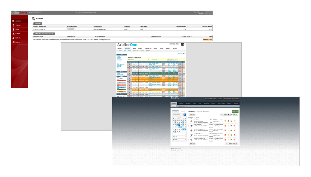
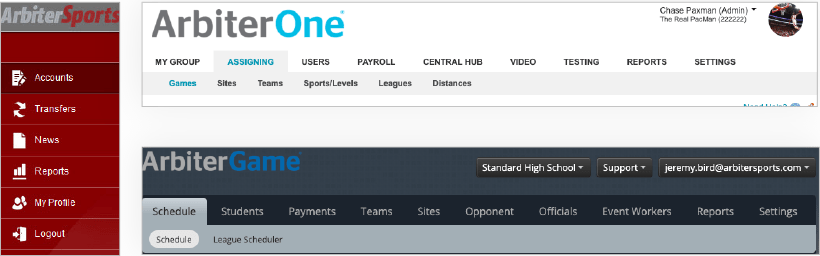
Over nearly 30 years, Arbiter had built many products for various personas: governing body admins, referee assigners, officials, athletic directors, finance, etc. Each had their own product brand, and in some cases, completely unique domains.
These products, while intended to be complimentary based on persona, contain too much overlap between personas which resulted in a very disjointed user experience. The look & feel was also completely different. One challenging thing was that a single person often performed the role of multiple personas and was constantly switching from one product to another to get their work done.
The outdated technology these systems were based on also prevented simple usability enhancements that users have come to expect from the software of today.
In addition to usability & branding concerns there were 3 major areas of concern from the business:
PERFORMANCE PROBLEMS - some of these products had been in use for nearly 20 years. This had started to cause some major performance problems. Bugs were increasing, and the code was very fragile. We often found ourselves breaking production with new releases and developers were afraid to even touch some areas of the code.
CHURN - for the first time in company history, high school state sport associations who had been with the company for years (some for decades) were starting to look at other options. While we had enjoyed market dominance for years, user-focused disruptors were starting to come on the scene and we needed to up our game and join the Experience Economy.
SECURITY & ACCESSIBILITY - while security and accessibility standards had evolved quite extensively over the years, we had not kept up with them. Our ArbiterPay product was secure, but there were improvements that needed to be made. Accessibility had never been a concern and we wanted to start taking that more seriously as well.
TASK
Architect a better user experience from the ground up and create a multi-year strategy on how we could get there.
I was hired & tasked with redesigning the ArbiterSports platform from the ground up. This was to be accomplished in a multi-phased approach and unify all functionality into a single platform.
4 Main Goals
There were 4 main goals or desired outcomes we set out to accomplish:
1
REDUCE CHURN & INCREASE RENEWALS
This was a pivotal time for the company. We needed to reduce churn and increase renewals. Churn rates were not crazy but it was the first time in many years that we had started to lose big customers. We wanted to nip the problem in the bud while we still could.
2
INCREASE QUANTITY AND FOOTPRINT OF PROCESSED PAYMENTS
A large portion of our revenue comes from processing transactions as states & local assinger associations pay officials. We saw a big opportunity to increase both the number of transactions and expand into different types of payments.
3
REDUCE NUMBER OF SUPPORT CALLS
During the "busy season" when governing bodies are setting up eligibility & registration requirements, officials are registering to officiate, and assigners are scheduling officials to games, we get a large amount of calls & support requests. By providing a simpler, more intuitive user experience we wanted to reduce the number of support calls our team was receiving. Nearly 50% of all support calls/emails were related directly or indirectly to our eligibility & registration system. These were calls we set out to eliminate as much as possible.
4
SET A NEW STANDARD FOR USABILITY
One of the main reasons for investing in building a UX team at ArbiterSports (hiring me) was that the executive team and board understood the need to take usability and customer feedback seriously. Arbiter historically had been a very customer-centric company, but up until I was hired in 2019 that customer obsession had been focused more on sales/support. Leadership recognized, however, that to continue to be the leader in the market, we needed to not only value but also understand our customers. That customer-centricity needed to be reflected in our products not just the way we sold and supported them.
When I was hired the initial thought was to just "redesign" & build each page in a modern technology stack. As I started diving in and becoming more familiar with our products, it quickly became apparent to me that a more foundational change was needed.
2 examples of usability needs
Let me share just 2 examples of usability problems that were baked far deeper than simply surface UI problems.
1
'CONTEXT SWITCHING'
A "context switcher" was added to navigate from one product to another. It was broken out by Group (organization) and persona.
One of the difficulties was that you just had to know which role would take you to which product. Each selection also completely changed the UI.
It was a very jarring user experience that was baked into the entire system.
2
NAVIGATION & MENTAL MODELS
Another problem was that navigatioin did not follow a consistent mental model & was very different per product. This resulted in increased cognitive load (which led to perceived frustration).
We needed to solve the information architecture problems first.
ACTION
Combining 7 disparate products into 1 seamless experience
The first thing I did was spent time learning our various products. Some initial ways I approached that included:
- I took the customer service product training course
- I spent 3 hours once a week listening in on customer support calls
- I interviewed all key stakeholders and front-line employees from every department
- I challenged myself to set up and configure my own test account in our 2 most predominant products, ArbiterOne and ArbiterGame.
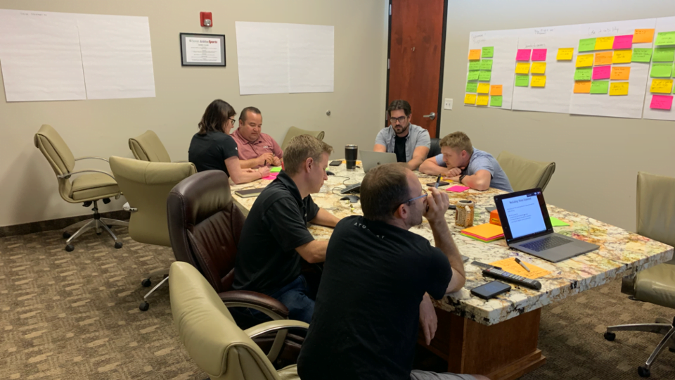
Affinity Mapping session to gather shared understanding and assumptions from cross-functional stakeholders
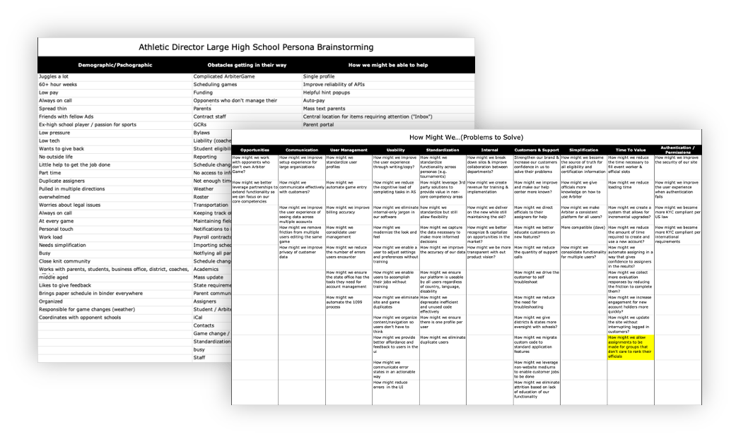
I got a group of team members and stakeholders from across the company together for an Affinity Mapping brainstorming session. Participants included representatives from the executive team, product, engineering, implementation, customer support, and sales. Together, we captured our collective assumptions around users, pain points, core tasks, and key competitive advantages we didn't want to lose in the new platform.
From there I aggregated all the research together in a single spreadsheet that was easy to visualize and share across the company with stakeholders who weren't at the meeting. I got some feedback and a few people added to the document. I had everyone list problems using "How Might We..." statements so we could avoid the tendency to focus on solution implementation rather than problem identification.
Understanding users & pain points
With that knowledge in tow, my product management partner and one of our veteran sales reps and I embarked on a road show visiting many customers across all our core user types to interview them in the context of where they work to understand areas we had it right, and learn additional details that would influence the direction we took.

From there I aggregated our research findings into project personas that captured Jobs To Be Done, Core Tasks, Key Drivers, and current Pain Points.
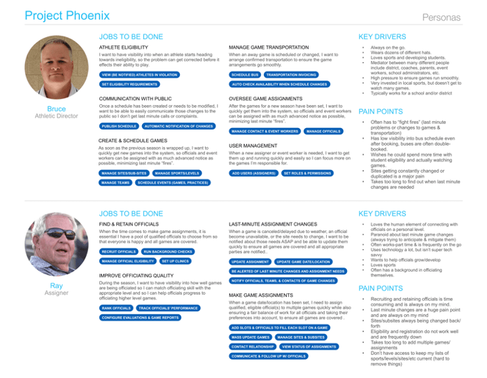
One specific takeaway from our research was how much overlap there truly was between personas and how widely responsibilities varied from organization to organization. A single person often performed the duties of all our personas, while in other cases it was far more specialized. This led me to the hypothesis that a user-based rather than persona-based information architecture was needed.
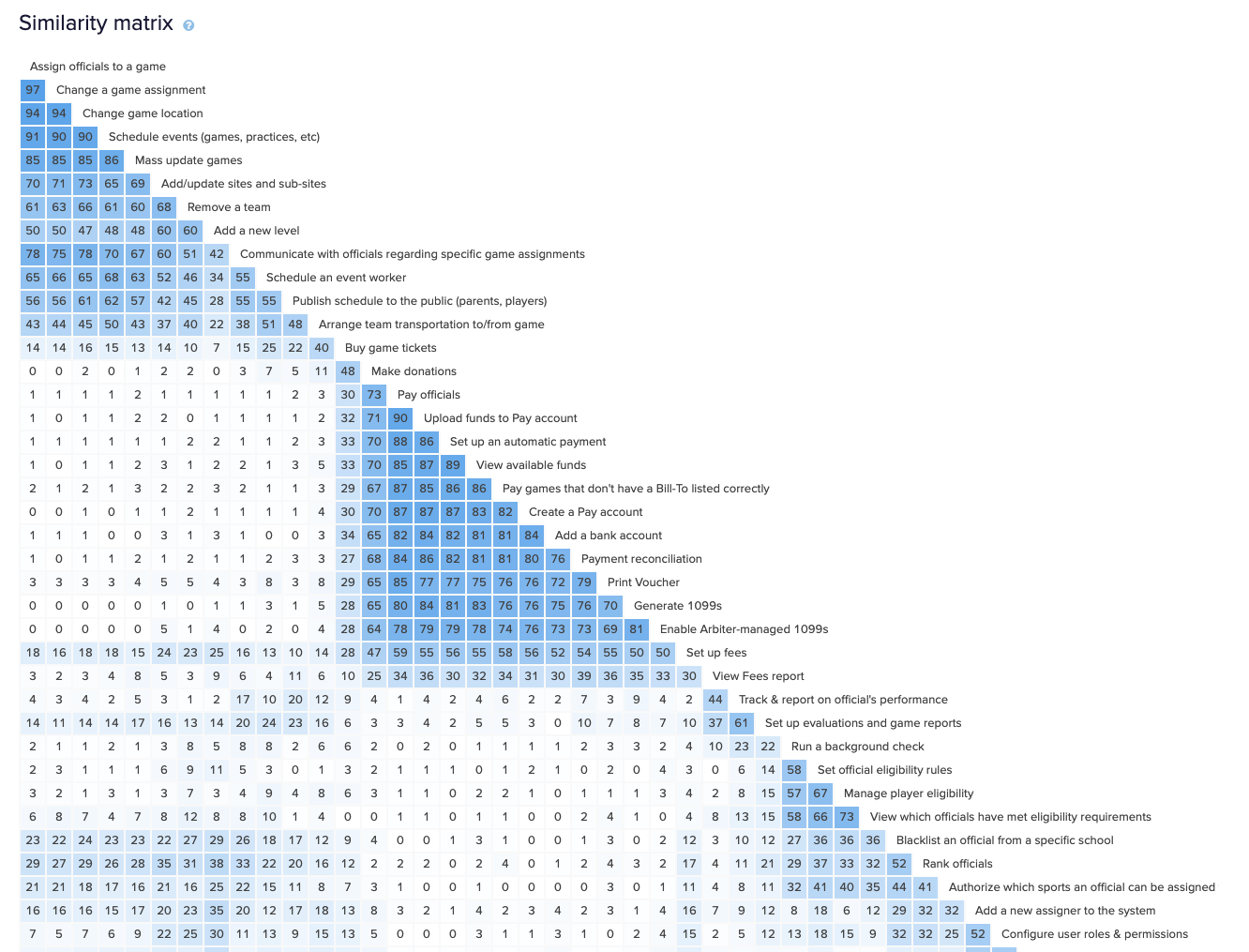
Content Inventory of existing products
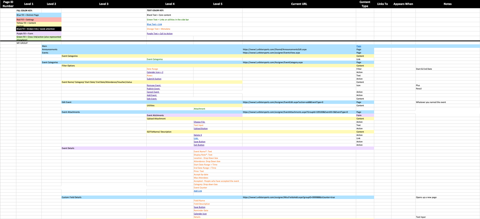
At this point I had a pretty good grasp of the users and their pain points, but I needed to understand just what I was getting into. What were the building blocks I needed to arrange differently to provide a better experience? To make sure I had a complete understanding of our existing Information Architecture of our platforms I created a Content Inventory with the help of a couple senior support agents. In a spreadsheet we outlined all the pages, content, functionality and how it all fit together across all our products. This took time, but it was well worth it once it was done.
Designing a new information architecture
The task now became designing a new IA. I had a pretty good hypothesis and a few ideas floating around my head. But as this could be a large change for users, it was vital to test my ideas.
I mapped out common tasks by persona and job to be done, then got feedback from stakeholders 1 at a time to identify tasks I might be missing. This was similar to the brainstorming we did before our contextual inquiry except that it was informed by research and it was much more granular.
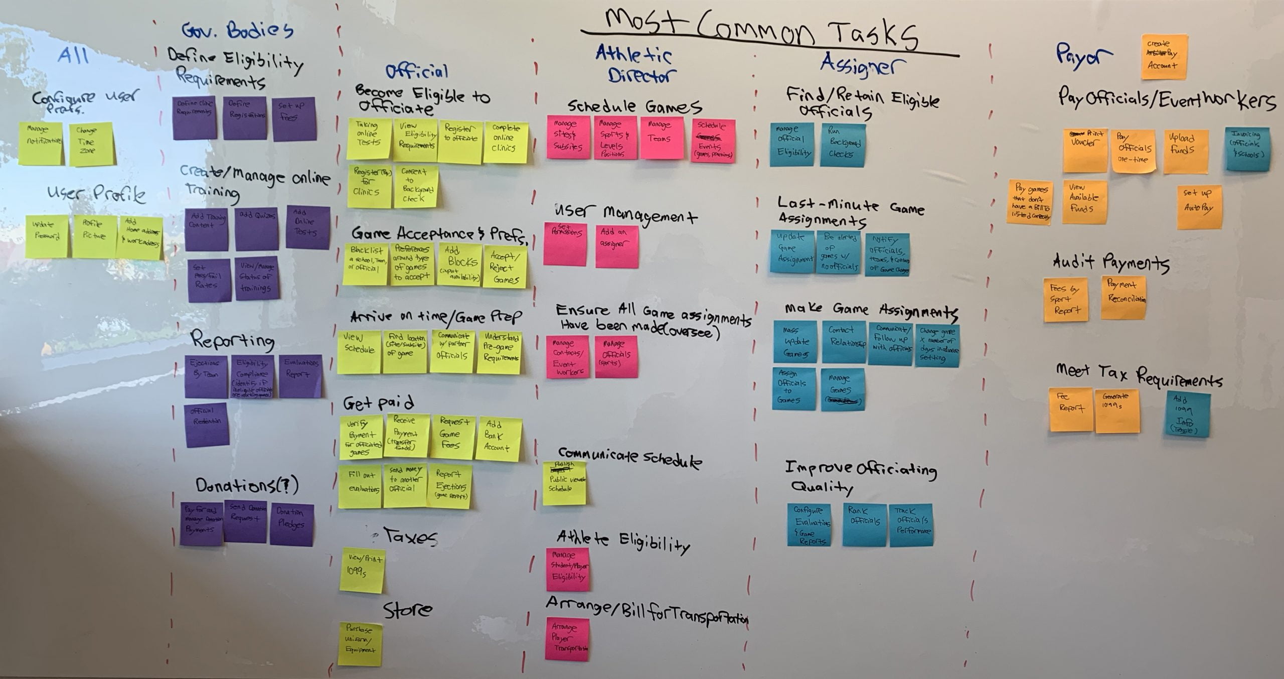
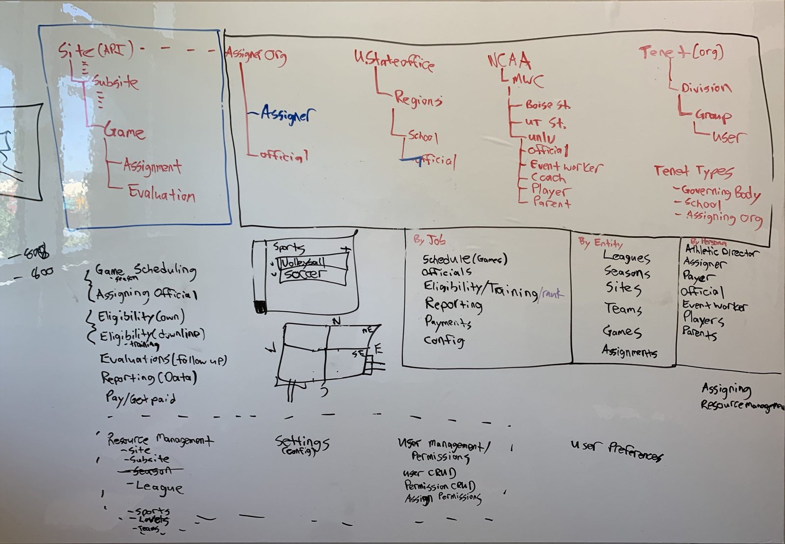
Next, I started imagining different ways we could structure and group those actions in a way that would be standard across personas so that we could follow a user-based architecture and get away from the persona-based architecture of the past. The three main grouping strategies I came up with were: by job (to be done), by entity, and by persona.
After talking with a few stakeholders, the team's consensus was that by job would be best. Howevever, it was vital that we test that assumption with actual users. So I set up a Hybrid Card Sort study. This would surface a list of tasks and participants had to sort the tasks into predetermined categories (my hypothesis). However, they could also create their own categories if they thought the tasks didn't fit neatly into one of the preset ones. I send invites to 1,000 users across our Assigner, Officials, and Admin personas.
I chose a hybrid card sort (as opposed to open or closed) because I was worried that:
- If I used an Open Card Sort (participant creates all the categories) participants would just spit out the categories they were used to. (Some of our customers had been using our product for decades).
- If I used a Closed Card Sort (categories are set and they cannot create their own) that I might miss critical holes in my thinking.
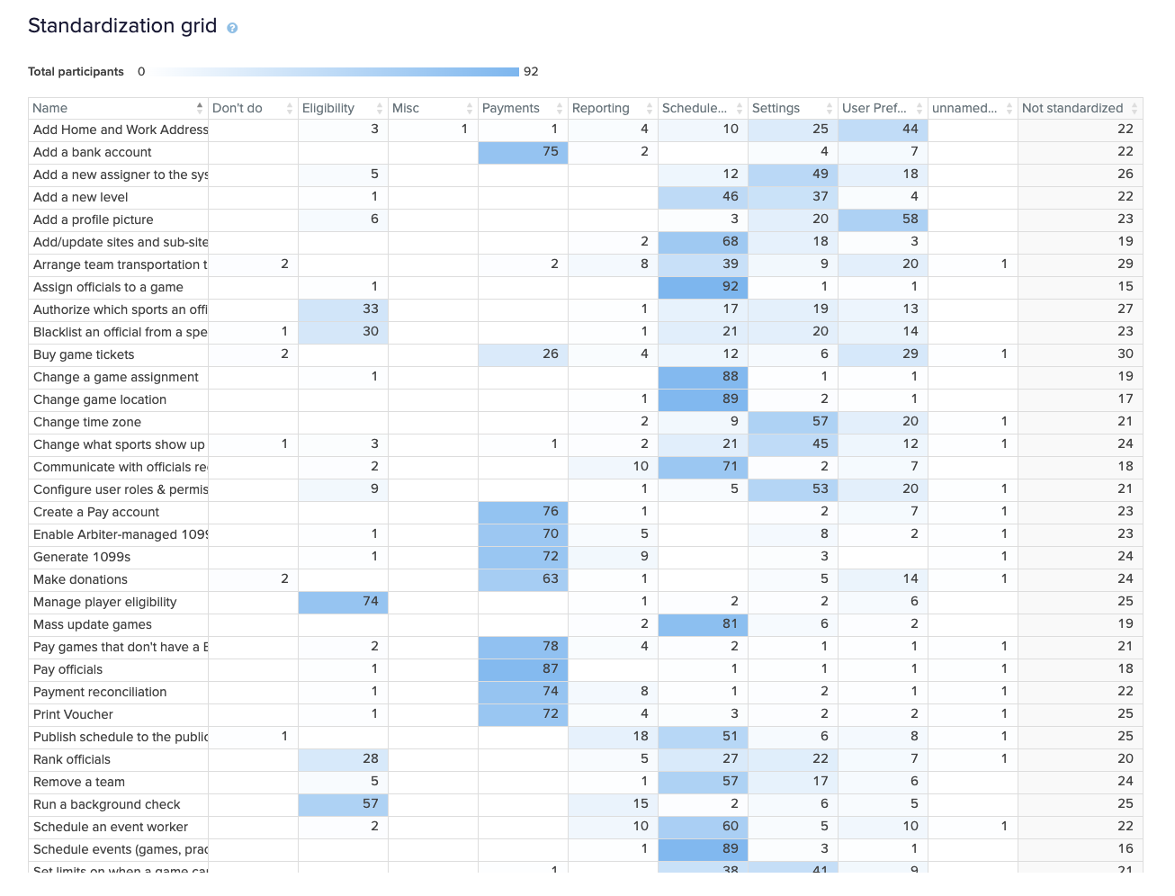
Overall, the categories I had chosen made sense to the vast majority. The biggest area of confusion, was "settings". In our old system we had settings all over. I knew in the new system we had to do better.
One way I addressed this, was separating settings into 3 groups:
- Admin settings (settings that need to be configured at the beginning before the system can be used). I created a section for these called "Resource Management" (later shortened to "Resources"). These included things like Teams, Sports, Sites, BillTos, etc.
- User Preferences (preferences that pertain to the user but don't effect anyone else). I put these under the user profile. These included things like Time Zone, Language, default table row height for all pages (there are 3 sizes available in our design system), base font size, etc.
- Page Based User Settings (settings that matter in the context of a single page). For example, a particular filter that should load on the Monitor Eligibility page. These are user-specific but aren't really global settings. These are used sparingly. They're more to enhance the usability of the page instead of changing the feature set. On of the biggest pain points with settings was that settings were placed in the context of a single page that should NOT have been.
Design decisions meet migration strategy
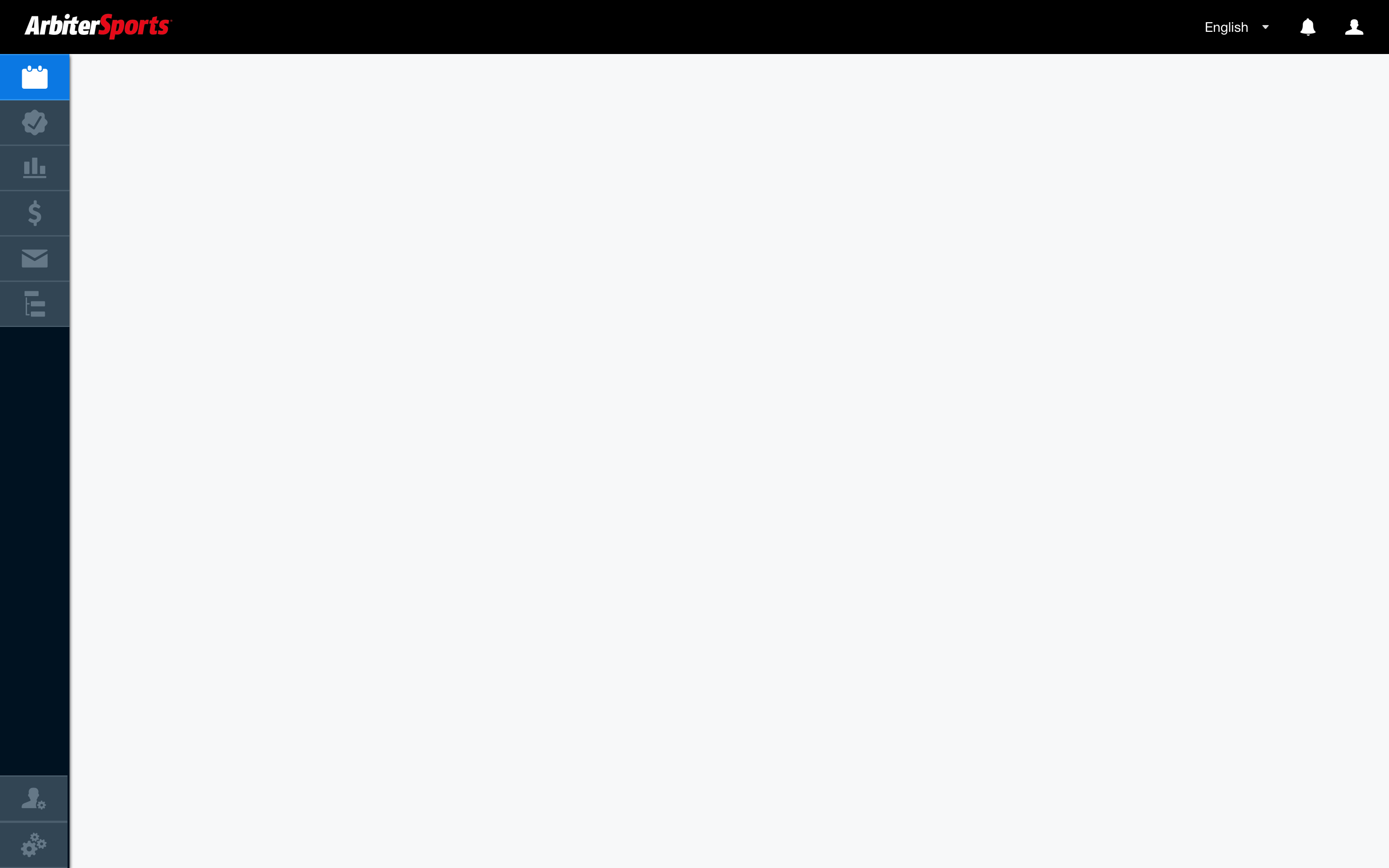
I started to explore how the navigation might work. My initial thinking and explorations were around a vertical nav. I wanted to get the nav out of the way as much as possible to provide more flexibility & room for content. I was worried a horizontal nav would take up too much vertical space. I wanted the platform to have more of a software feel than a marketing site.
However, this project would take 2-3 years to migrate all functionality into the new platform. APIs, Databases, & authetication would have to tweaked or rewritten completely in addition to the UI. In discussing with the team we were all worried that changing too much all at once would result in a jarring experience for customers and it could end up being perceived as a worse user experience.
We decided to take a more gradual approach.
STEP 1
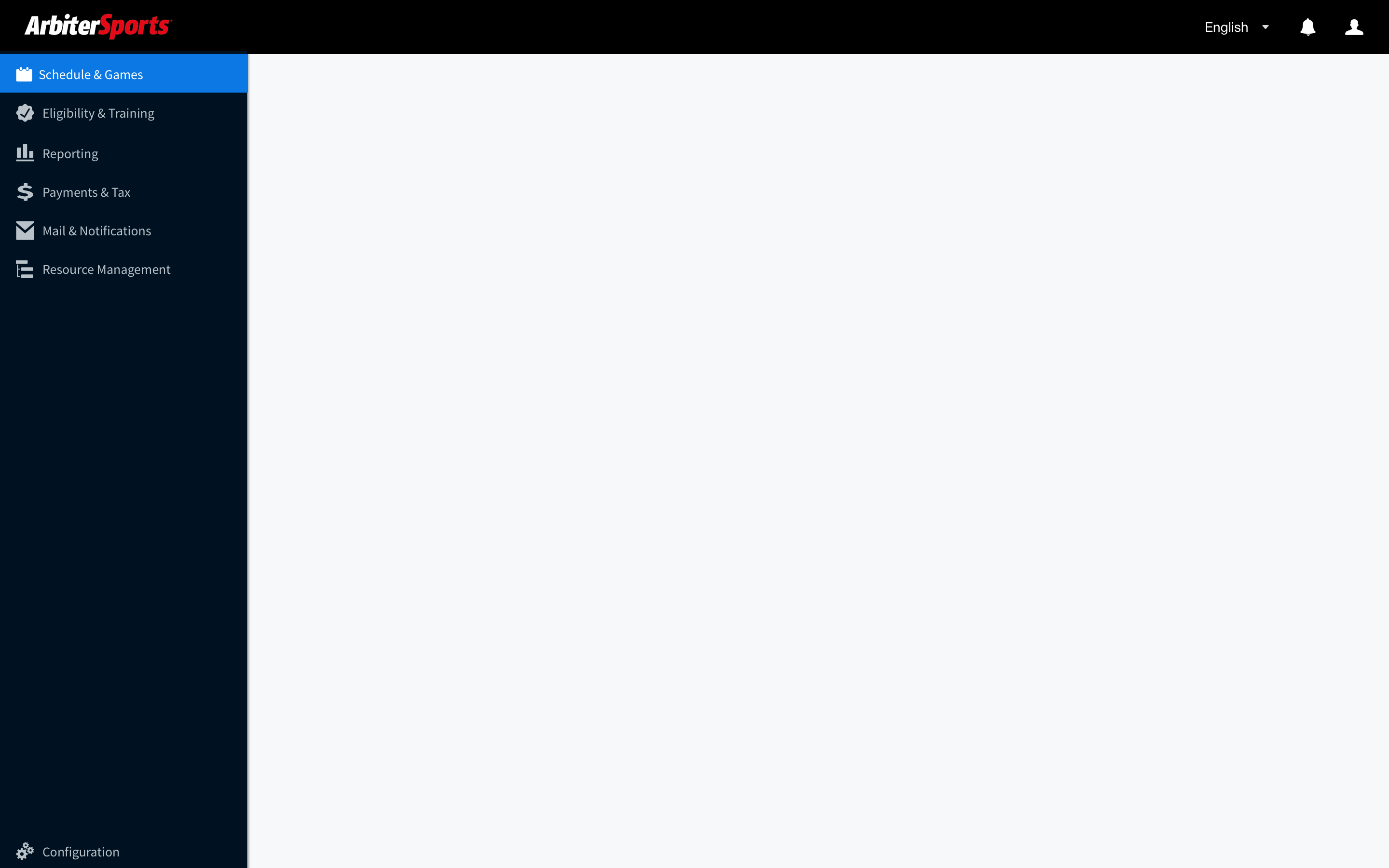
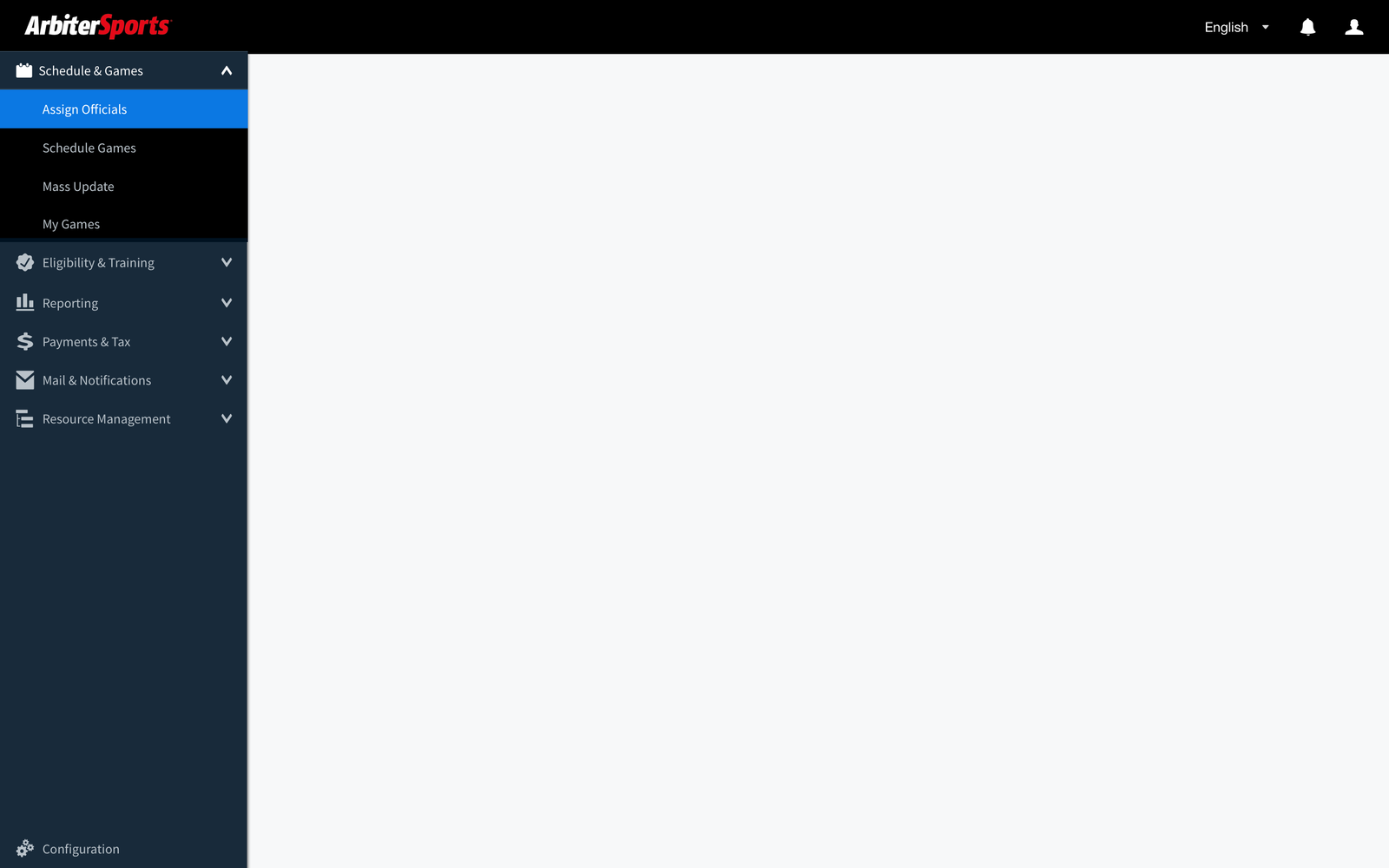
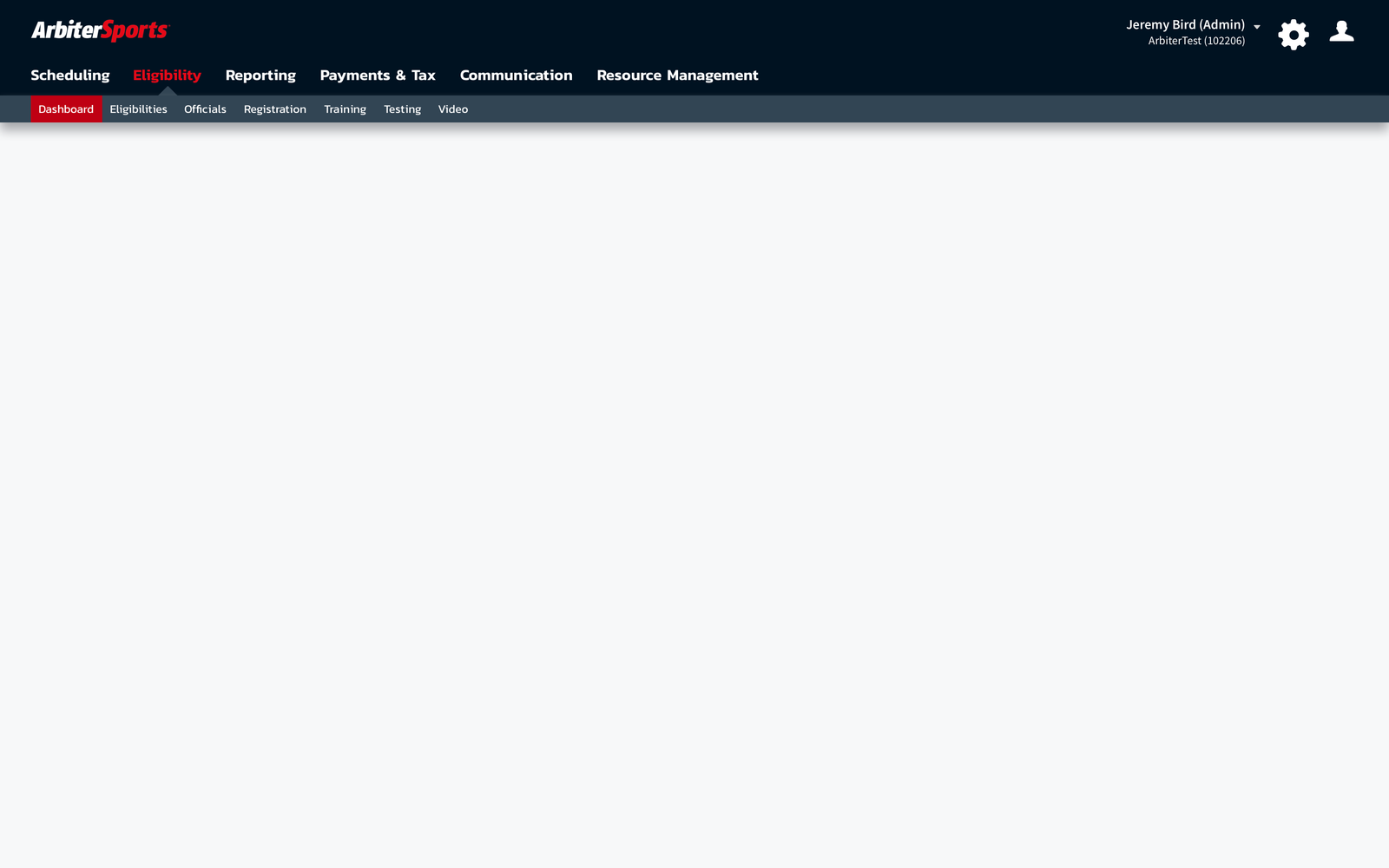
We had already introduced new standaridized header/nav styling into our legacy products. We decided to go with a horizontal nav for the new platform so the experience between old and new would be much less jarring.
STEP 2
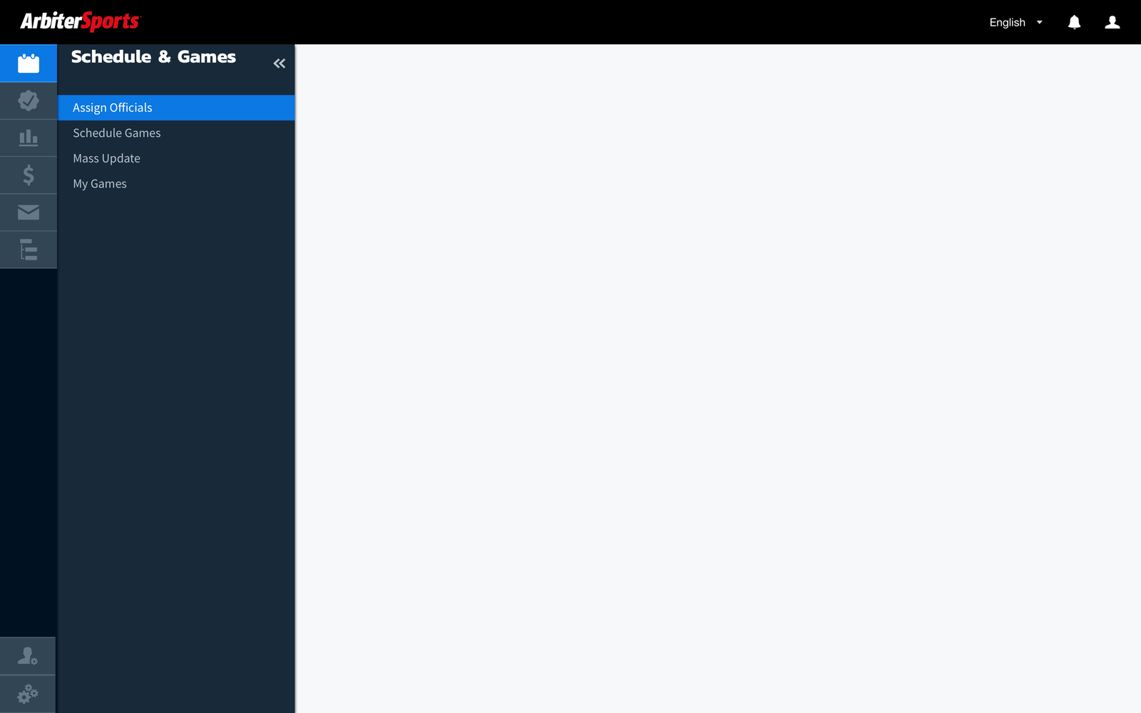
We would introduce a new main nav/sub nav across all legacy products following the new information architecture (without moving content on individual pages around). This would allow people to get used to the new IA.
STEP 3A
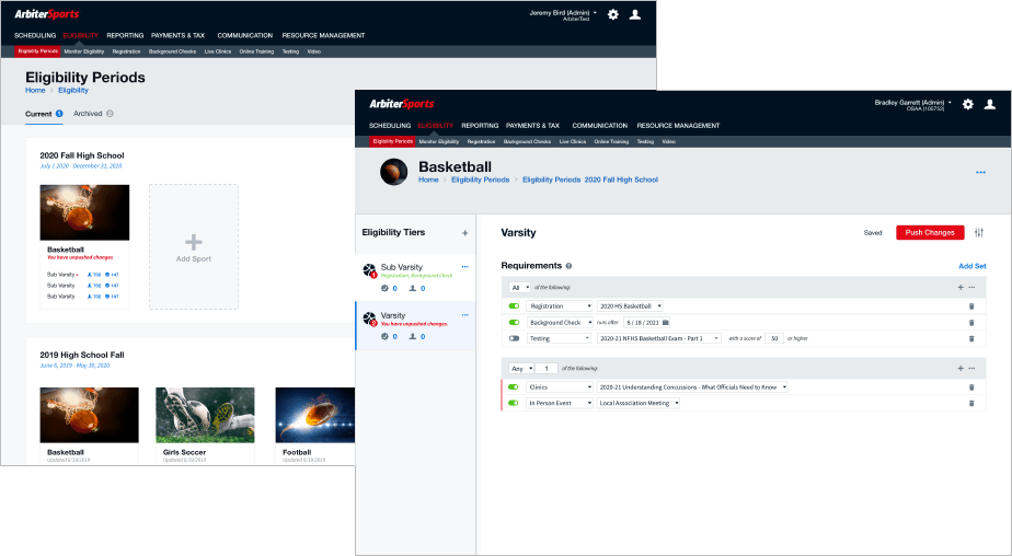
We would migrate functionality one main section at a time. So when they clicked "Eligibility", they would then be taken to the new eligibility pages, but the nav was already in place. This was one of the big reasons we decided to go with Jobs To Be Done-based IA instead of any of the other options we considered.
STEP 3B
As we migrated each section, we would introduce the user-focused model combining sub nav sections. For example, when we redesigned Eligibility & Registration, you would see the sub nav item for registrations you're configuring as a State Admin next to your personal registrations to officiate, all under the same main nav section of "Eligibility". This would reduce context switching while yet also making the change to a truly integrated platform more gradual.
This approach would take longer, but it would ensure a great user experience all along the way, not just at the end.
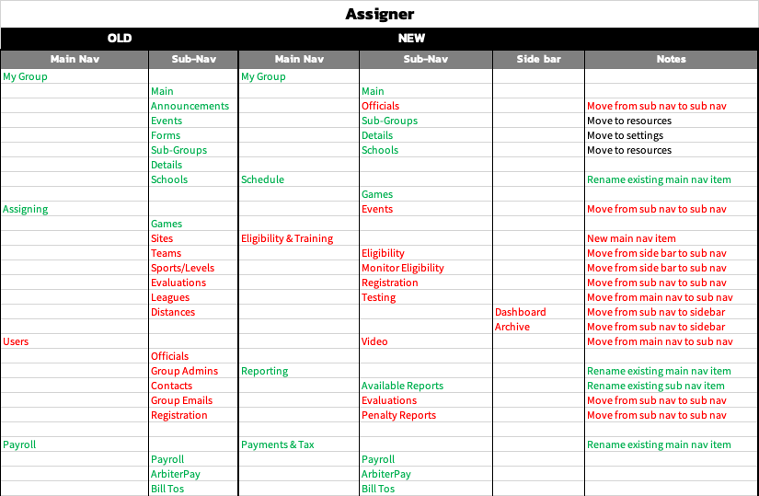
So we started down the path of Step 2 (Step 1 had been completed at this point). I started mapping how we would transition the old IA to the new. Green meant no change was necessary. Red represented a change between old/new.
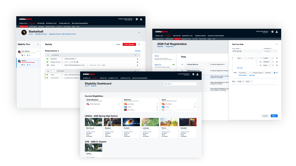
Eligibility & Registration were chosen as the first chunk of functionity to migrate
In working with the executive team, product management, sales, and various other stakeholders, we chose Eligibility & Registration as the first chunk of functionality to migrate to this new information architecture. That decision was reached for a few reasons:
- It was a common pain point expressed by customers considering leaving for a competitor solution.
- It was by far the most volatile code and database architecture.
- It was the most "standalone". (Many other chunks of functionality (like Scheduling for example) touched nearly all other areas of the code and would have been a huge process. We wanted to work out the kinks before we undertook a gigantic project.)
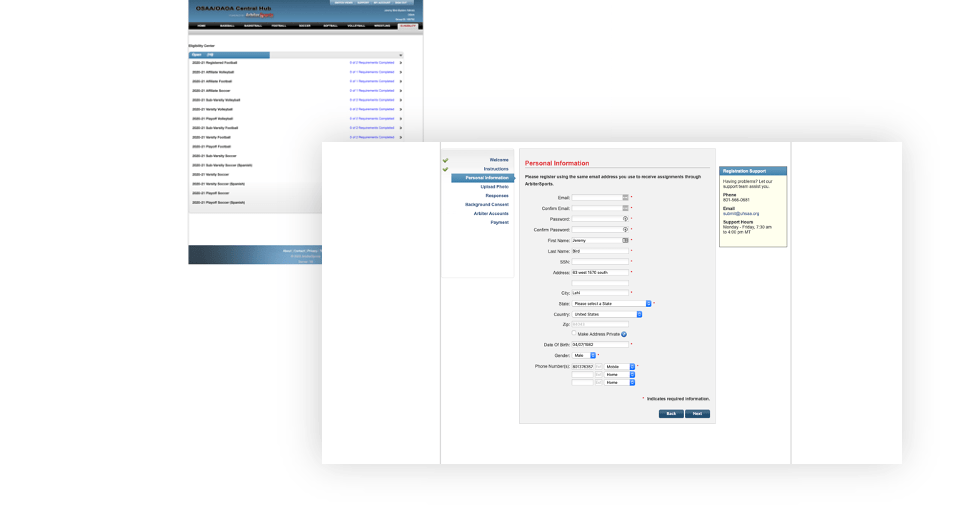
The experience of redesigning Eligibility & Registration was a fairly involved project of its own with its own pain points, user research, and design initiatives. I will write a separate case study going over the full process. For now, suffice it to say that process involved:
- Customer interviews
- User & process flows
- Database architecture discussions/planning
- Group brainstorming (with stakeholders AND customers)
- Multiple iterations and explorations of the interaction design
- Prototyping and usability testing
- Choosing a new front end technology
- Choosing & implementing a design system
- Working with development closely (this was a new thing at Arbiter).
- Etc.
Old
New
RESULTS
The most successful product launch in company history.
By far this product was the most successful launch in company history. Even though we took a pilot release approach (gradually releasing to a limited number of customers at a time, and knew that all customers wouldn't be able to move at first, we ended up being overwhelmed at how many customers were simplifying their internal processes (pricing structure for Registration for example) in order to be able to join sooner. It was a great example of how much better a user experience can get by doing the extra work up front to understand customers.
A couple of my favorite quotes we received for a customer during the release process:
- "You’ve always had a great product offering, but I can tell that now you’re even more in touch with those of us actually doing the work!"
- "I refused to let anyone else use registration in the past because of the sharp learning curve. This new system I could train everyone on in a heartbeat."
- "I'm impressed with the customizability. Yet it's still simple."
So what about those results we set out to achieve? Here's just a few of the results we were able to achieve:
50x reduction in # of eligibilities needed to accomplish same Job To Be Done (25x reduction in Registrations)
One of the biggest pain points that existed in the old system was having to create separate eligibility requirements & registrations for every level and fee structure per sport our clients offered. This often created upwards of 100 per year. Each one had to be configured and updated separately. We were able to reduce this number to 1-2.
Solidified customer loyalty in a big way
Eliminating churn was one of the big focuses of this project. Some related results we were able to achieve included:
- Solidified client relationships with 1200+ schools across 11 states (states that were considering leaving us that enthusiastically decided to stay after the product release)
- Won back 3 former state associations contracts (who had previously left us)
- Signed 2nd biggest deal in company history as a direct result of this project
In addition, when one of our biggest partners (who was the de facto leader in sports-related insurance and testing content) decided to break ties & compete with us instead, we were able to win over the vast majority of their customers.
Customers simplified their internal workflows to be able to get on the new platform sooner
This is my personal favorite. One client in particular who was very skeptical when we first approach them to be a part of our user research during the design process, after seeing the solution we came up with, not only were interested in moving to the new system but simplified many of their processes and fees to be able to be a part of the initial pilot group.
CONCLUSION
User-driven design cultural wins
There were many wins besides just the direct business outcomes and results. This was the first time a cross-functional, user-driven design process had been used at the company. Before this project developers and product managers rarely collaborated except to estimate user stories. Design had never really been a fundamental part of the process. The process being used previously was more like waterfall with a few scrum processes thrown in, than true collaborative agility.
During the course of the project the following cultural wins were achieved:
- Developers were brought into the process and got excited about observing user research.
- Design system was established and engineers were won over on how much easier/faster it made development.
- A cross-functional team was established, and developers, PMs, QA, and I all sat next to each other in a team room--and we all loved it.
- Development is bringing ME into discussions that previously were purely engineering. (Database architecture, pipeline creation & flow, etc)
- Requirements from Product Management became much more "problem focused" than a list of features to implement.
- All key stakeholders are now "drinking the kool-aid" of the value of UX.
- More UX resources have been requested by someone other than UX.
We still have a long way to go in both the product and culturally, but this project changed the course of the UX maturity of the company. It's now not a conversation of "if" (we should invest in UX) but "how many" and "when".