DIGITAL GUARDIAN ANALYTICS
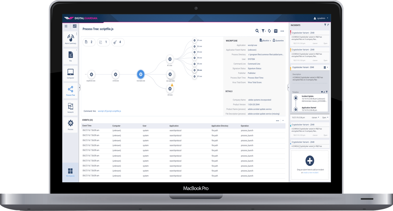
In January of 2016, I was hired to oversee the UX Design of a new SaaS data security platform (built on Java and Angular.js). The goal of the application was to provide data security analysts an easy way to identify, detect, prevent, and remediate intellectual property theft from large-scale enterprises. This is the story of how my team and I were able to take a very complex problem operating under both time and functionality restraints set by management, and create a solution that was powerful, efficient, and effective.
To comply with my confidentiality agreement I have included only limited full-res screenshots. It is my goal to catalogue the process I went through solving a complex enterprise software problem, rather than an in-depth explanation of the final result.
INTRO
My Role
I owned the Information Architecture & Interaction Design, SASS/CSS structure in the code base, and personally did much of the production styling. I was also a strong contributor on the visual design and user research. For the majority of the project I was the sole ux designer working under the direction of the UX Architect. Toward the end of the project, another designer was brought on board and since I was much stronger in HTML/CSS than he, I focused more on getting the styling structure set up and implemented while he focused on refining the Visual Design and Style Guide.
Additionally, working as part of an Agile/Scrum team, I collaborated with many front end/back end developers, Product Management, a Platform Architect, QA engineers, Data Analyst stake holders, and executive stakeholders on a regular basis.
THE CHALLENGE
Analytics Platform to Scale
The executive team approached us with 3 clear objectives in creating a cloud platform—to allow data analysts and IT administrators to identify & prevent data security breaches and intellectual property theft more easily and consistently; to seamlessly scale the DG Platform to hundred of thousands (or even millions) of endpoints; and to be able to remediate breaches as well as identify/prevent them. In addition, due to the varied/complex nature of data security, an out-of-the-box one-size-fits-all algorithm would be ineffective so the platform needed to be highly configurable yet the results needed to be clear and actionable.
Due to some political reshuffling and past engineering failures, we had a tight deadline to work with for such a massive project. Very little time was given to validate personas, conduct ethnographic research, or usability studies. As such, we leaned heavily on sales feedback, previous executive knowledge of the industry and our target users' pain points in what they were trying to accomplish. When I took over the project, there was already much of the architecture and UI in place though it was pretty bare bones. Even so, there were some architectural constraints that influenced the direction we needed to head in given our fixed timelines.
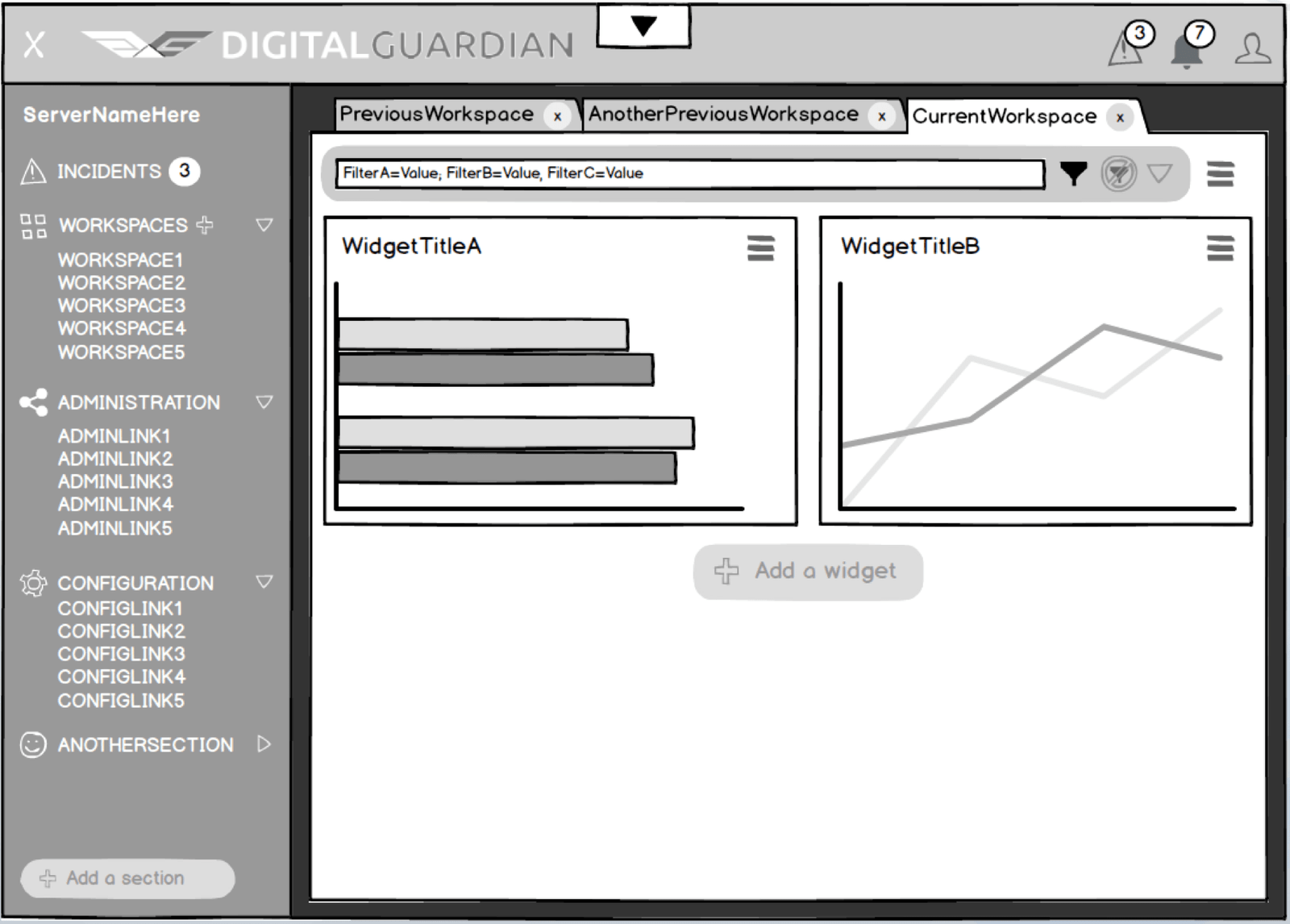
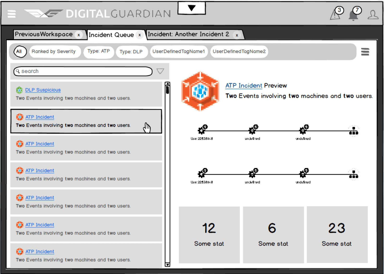
One of these architectural constraints was the creation of a collection of browser-window-like ``workspaces``. While I felt like a journey or investigation approach would have better match the target user's mental model, I wanted to understand the reasoning behind the decision so I spent some time going through the previous wireframes a contractor had done and interviewed some of the stake holders who had been with the company since the beginning.
Interaction Flow
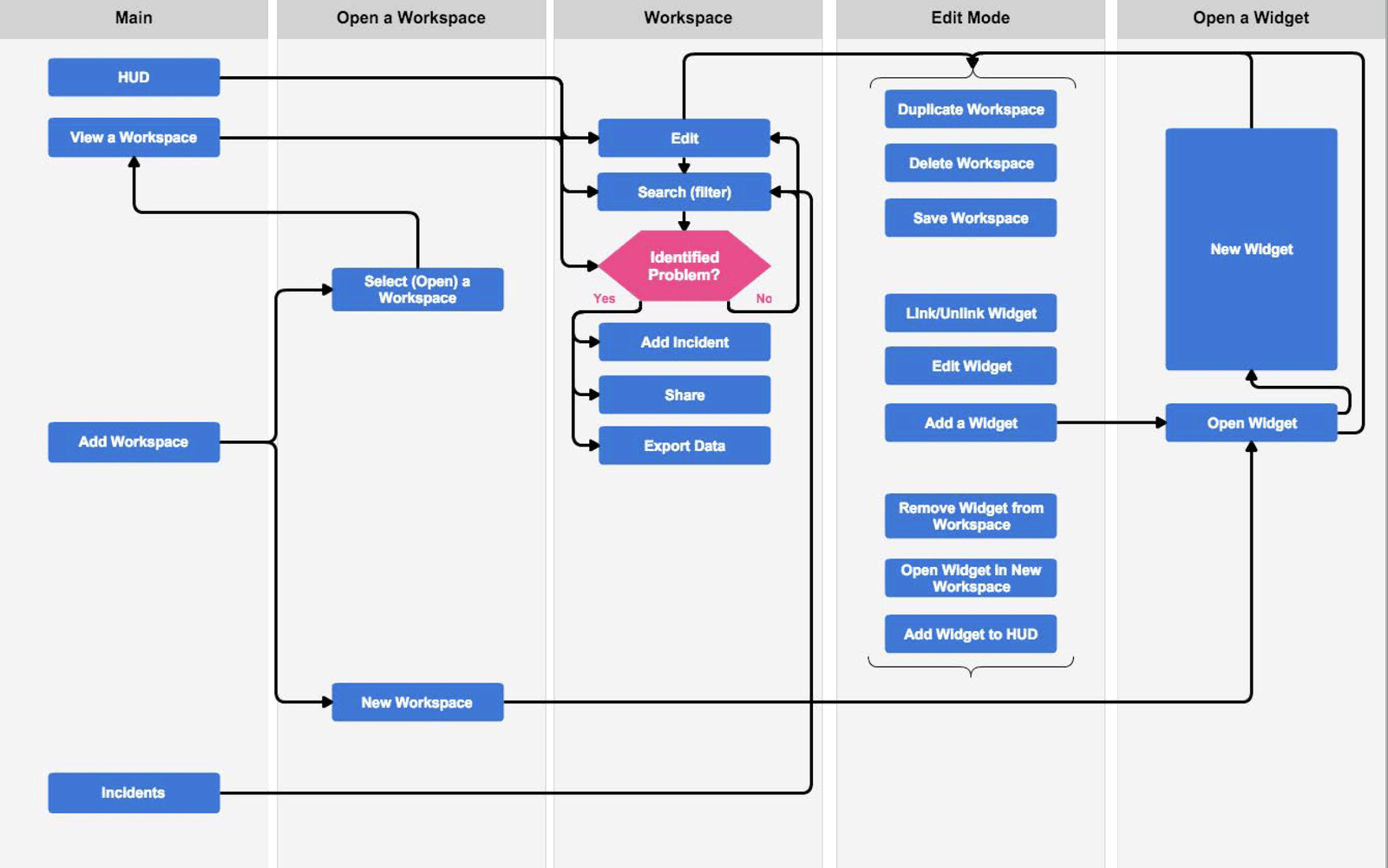
I also wanted to have an accurate understanding of the interactions currently in place as a starting point for looking how it could be improved. To accomplish this I created a quick flow diagram of the workspace creation and use that was in place at that point. This provided a spring board for discussion and further ideation.
DIVERGING IDEAS
Low Fidelity First
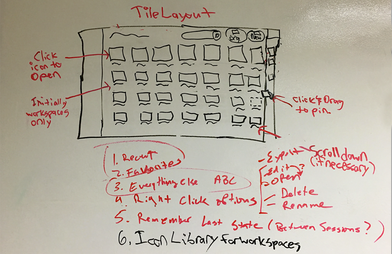
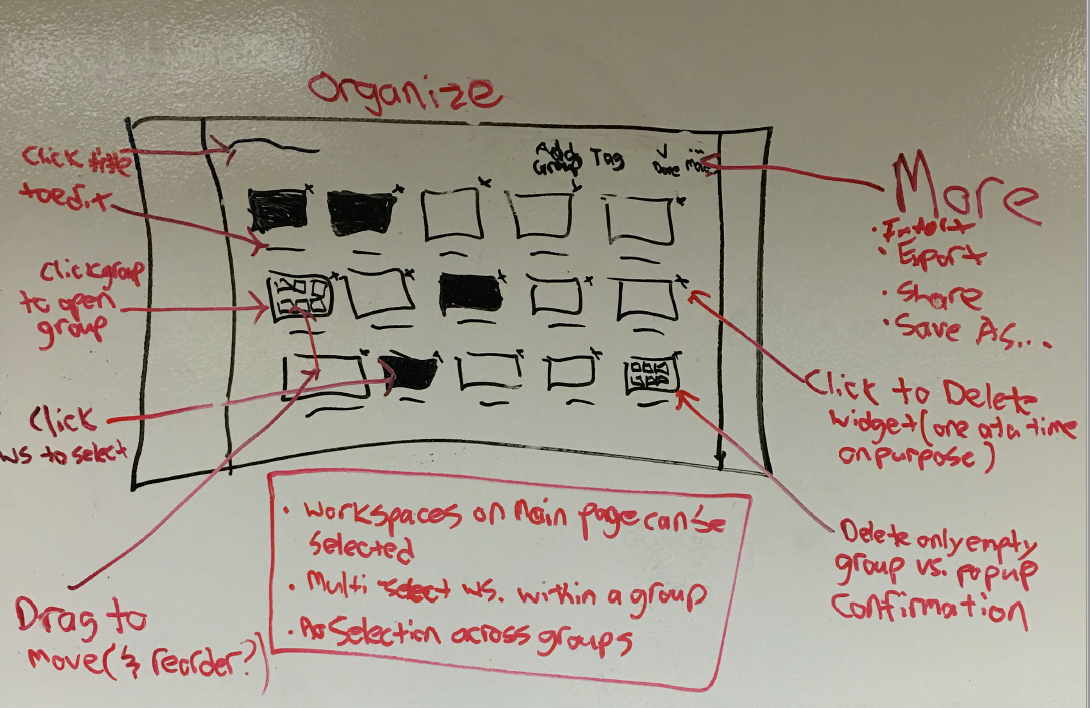
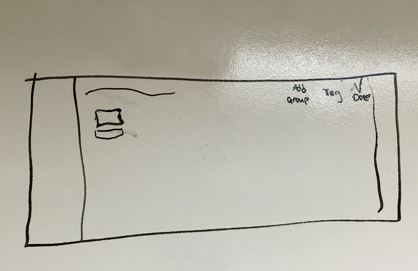
Since we couldn't restructure away from workspaces, I wanted to come up with a way to tweak them to be more meaningful. I held a series of white board exercises where I brought together various stakeholders and we white-boarded potential solutions. I then brought some stakeholders who hadn't participated in the discussion in, and did a make-shift paper-prototype-like exercise to get feedback on each one.

Opening Workspaces
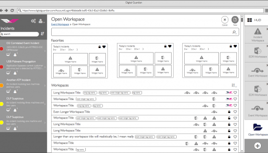
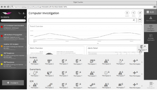
Following the feedback, it was decided to move toward a workspace doc paradigm where a user could pin their most frequently-used workspaces for easy access. There was some concern/difficulty surfaced in the research about the interaction of opening/creating workspaces. So I started to explore some different views that could offer more context to the user of what was contained in a workspace at the expense of less being visible at once.



CONVERGE & TEST
Prototyping as a Design Tool
As more feedback came in, we opted for a tile approach so we could get as many workspaces on the screen at one time. Additionally, developing some of the features I had invisioned (such as a preview of all widgets on each workspace) would have required an immense amount of API calls for comparatively little value. We opted to add a HUD (Heads Up Display) to show widgets the user might want to keep top of mind and leave out the preview for the workspace manager. We also filed some of the ideas (such as a list view as an additional view) in the backlog to come back to on a subsequent release.
Due to the fixed timelines, we needed to get developers working on building the solution before the designs were completely flushed out and validated. As we started to converge, I did some final iterating inside the JustinMind prototyping tool and ultimately created a functional low-fidelity (wireframe quality) prototype the dev team could click around and get a sense for the desired functionality. The plan was to get them building the UI framework while I finalized the higher fidelity styling.
To overcome the fact that we had 2 UI developers who worked completely remotely, I also prepared a demo video of myself using the prototype to provide some context on what the interface was supposed to act like. Focus here was placed on the interaction design, not the visual styling. I added just enough fidelity for it to be somewhat realistic but left it unpolished enough to ensure it wouldn't be mistaken as the final design.
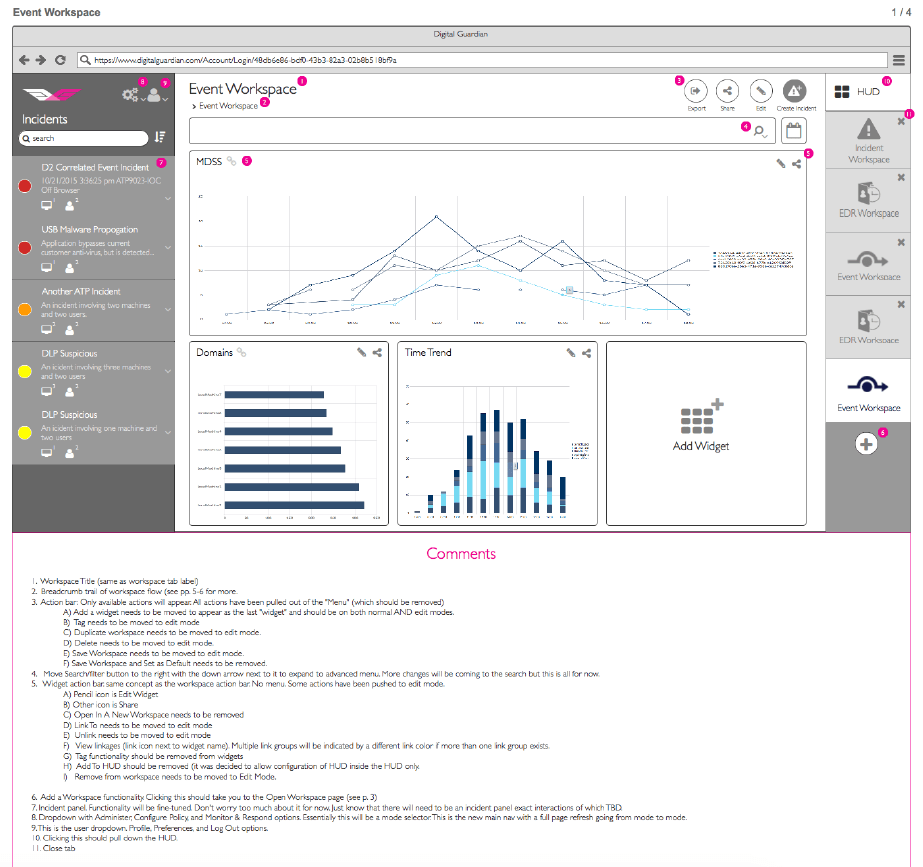
Annotated Wireframes
One other tool I used when a prototype wasn't justified was annotated wireframes. Initially I did this via a PDF file that was sent to the development team. Later, these were moved into Confluence into our Spec Documentation. This was especially useful when an interactive prototype wasn't justified.
DESIGNING IN THE BROWSER
Should Designers Code?
Whether designers should also code is an often-debated question among UX Designers. This is a skill that has often proved useful for me, and this project was no exception. As timelines began to draw near, and because I have an in-depth knowledge of HTML/CSS, my manager and I decided it would be more advantageous for me to set up and own the SASS-based CSS structure in the code base and do my high-fidelity designs in the browser.
This was no small feat as we wanted to support highly configurable color themes. I chose to use the Scalable and Modular Architecture for CSS (SMACSS) methodology as it fits nicely within both Atomic Design and also the modular-based nature of Angular.js that the UI was built with. I opted to set up modular sections for Fonts (custom icon font as well as web font), Layout, Mixins, Modules, States, and Themes. The basic idea was to utilize modules and mixins for repeatable chunks of work, put them together in layouts, then combine layouts with a programmed theme to make a section which was then compiled into a CSS file. We had separate CSS files for the main sections of the application so themes could be set on them independent of each other. For example, side panels could be dark and the main-content light or vice-versa. There were 5 sections in all.
After setting up the structure I also did the majority of the production styling and even after I eventually trained and turned the CSS development over to the UI Developers, I remained involved in doing design reviews and acting as a resource when needed. It has been my responsibility to make sure the designs get implemented correctly.
DESIGN JOURNEY
Look & Feel
Designing in the browser while simultaneously identifying a style guide proved to be unwise. I'm a big fan of designing in the browser once a style guide and pattern library are in place, but it is very difficult to do all at once. It resulted not only in my not being able to give the style guide sufficient time, but also in a complete restructuring of the CSS 3 times. In hindsight I should have done enough high fidelity mock ups to identify a style guide and THEN implemented the SASS structure and continued designing in browser from there.
Thankfully, about this same time another designer was hired to help with workload who had some experience as a creative director. Since I was stronger in HTML/CSS, he took over the style guide and I focused on getting the CSS structure and production styling. This process worked out very well.
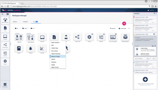
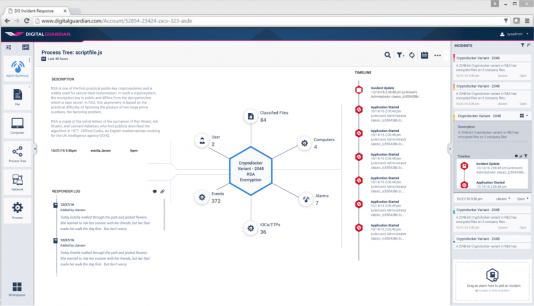
Also, he had been converted to Sketch at a previous company, and I had been meaning to learn it for a while, so we switched over completely to Sketch. After overcoming the learning curve I was able to act as a contributor and collaborator on the designs without needing to spend my time trying to do both visual design and css development. Here are some examples of what we settled on:

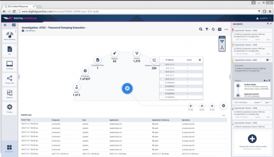
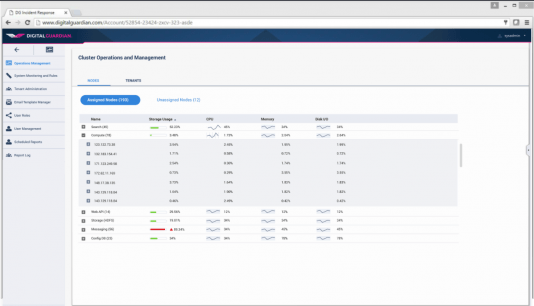
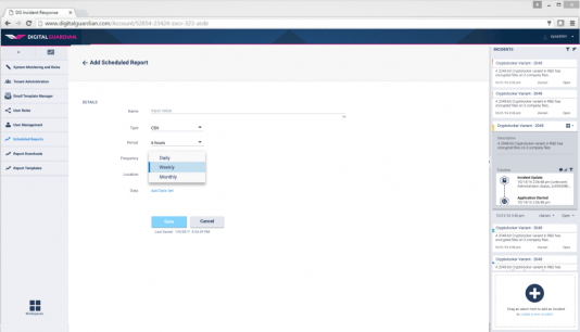
Micro-Interactions
One other area of focus and area of passion for me are micro-interactions. Anything to provide context and feedback to the user of what is happening or what will happen if they perform an action. I was instrumental in getting transitions and micro-interactions implemented in the application. Here are a couple examples of an animation I designed for one of the custom charts we built.
REFLECTIONS
Learnings from DG Analytics
One of the biggest lessons I learned on this project was that it doesn't work to design and code an entire platform efficiently at the same time. We let our timelines dictate some decisions that really affected productivity. In many cases, the product requirements were also being fine tuned at the same time yet we operated very much cut off from both our users and product management. We should have worked as a cohesive team better and been more outcome focused as opposed to output (timeline) focused.
One thing I hope to do better on my next project is to spend more time with understanding our target users and the jobs they are trying to accomplish, then later conduct usability tests to validate effectiveness. This wasn't a learning necessarily since I know the importance of it already, but was not allowed time to do it. Luckily we were able to solve many users problems with the time-bound approach we took due to how far behind our product was before this project.
I learned a lot about Angular.js and CSS3 during this project. These were two technologies I had been briefly exposed to before but being immersed in the code really helped me learn them well. I expect this knowledge will serve me well in the future. I also grew to love Sketch. It has it's issues, but overall is a great time saver. It's a very powerful design tool, and I'm glad I learned it.
© Copyright 2017 Jeremy Bird Design - All rights reserved.