Getting A/B testing platform redesign back on track
This is the story of how I re-established trust in UX, hired a great-fit designer in half the time and helped reduce test creation time by 56%.
SITUATION
At Target, we had an internal testing platform that could run A/B tests, marketing campaign tests, and ramp testing (for gradually rolling out updates to Target.com and Target app). It had become very clunky & hard to use which was causing severe delays in making billion-dollar design decisions.
PROBLEMS
The team had started a redesign a couple months before I joined the team, but there were trust issues with the designer on the project. Progress was being held up and stakeholders were not happy with the result. When I joined the team, I was asked to help get the project back on course.
After taking time to get the lay of the land and do some research, I identified 4 main problems:
1. There was a mismatch in skillset between the designer on the team and project needs.
The designer on the team was very junior and had been thrust into a complex redesign project. She didn't have the background in information architecture, research, or team building that this project needed.
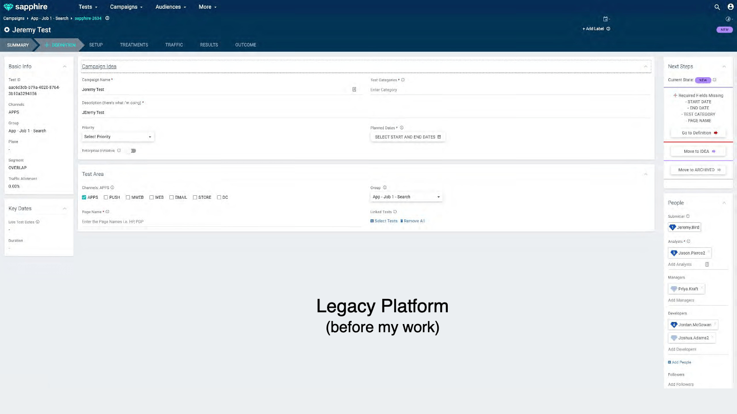
2. Sapphire was too complex to learn & use
Users had to have a product manager or trainer coach them step by step on how to set up a simple test in Sapphire. Then they had to have an analyst analize the test for them. (They couldn't make sense of it on their own). This added up to really slowing down decision making and resulted in productivity loss.
3. Inconsistency caused confusion & affected test validity.
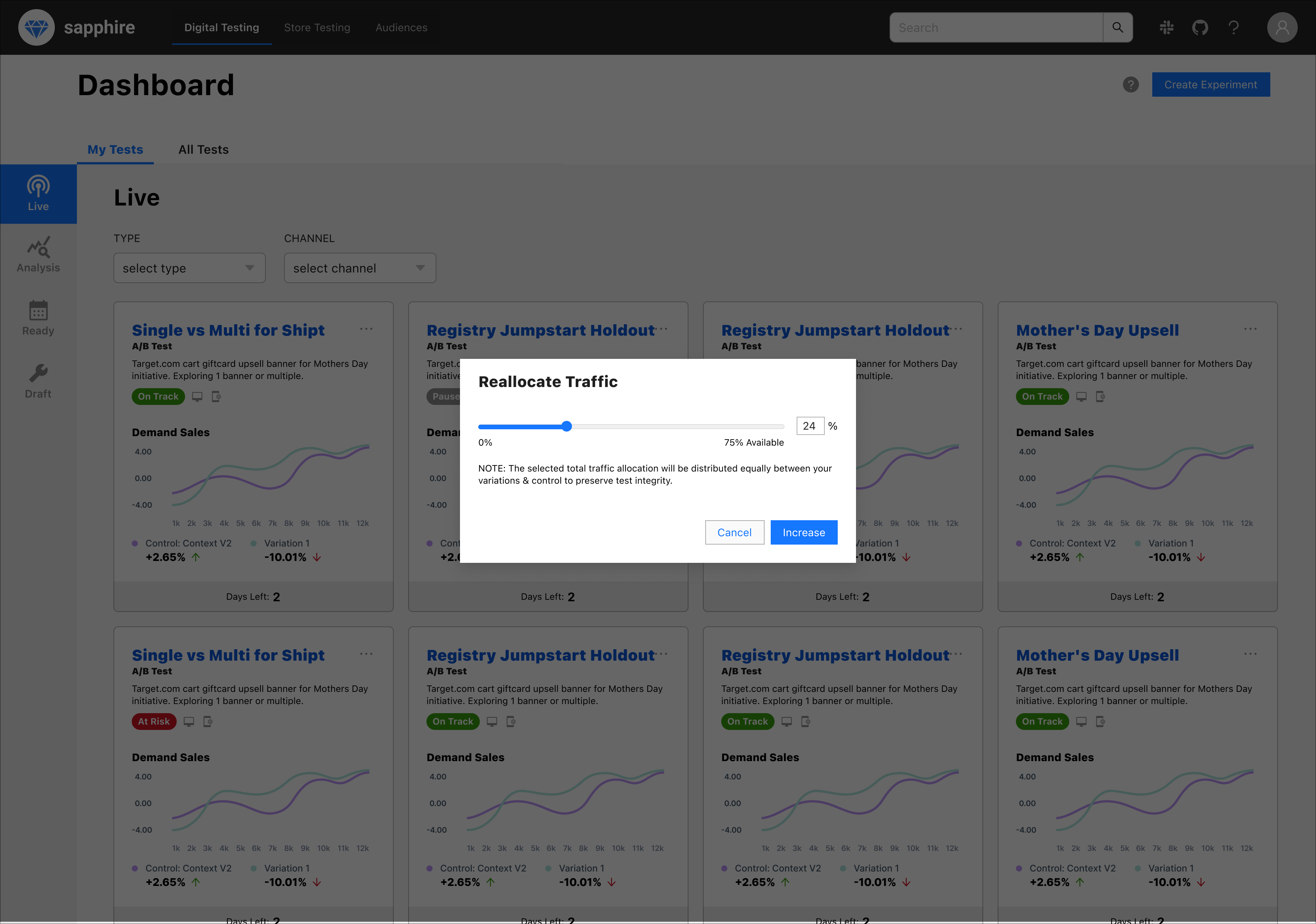
There were multiple ways to accomplish the same thing—none of which were intuitive, status of tests was unclear, and there was little trust in the data being shown. Usability flaws in things like setting traffic allocation were affecting test validity which in turn were misleading important decisions.
4. There was little to no contextual awareness.
You could be viewing a list of tests in flight and want to reallocate traffic, for example, and you would have to leave the screen to go somewhere completely different to update that. This forced constant context-switching. The app had been structured by features/actions rather than by user flows or goals.
ACTION
Better aligning skillsets to set team and designer up for success.
1. I found a project that was a better match for the current designer.
I worked with the designer's manager (she was located overseas, so I was not her direct manager) to align on a team that would be a better fit for her experience level and toolset. Ultimately, we agreed on a team that was fully located in India that had a more experienced designer as well that could provide mentorship. The project was also less technically complex and the scope was more right sized to allow meaningful contributions.
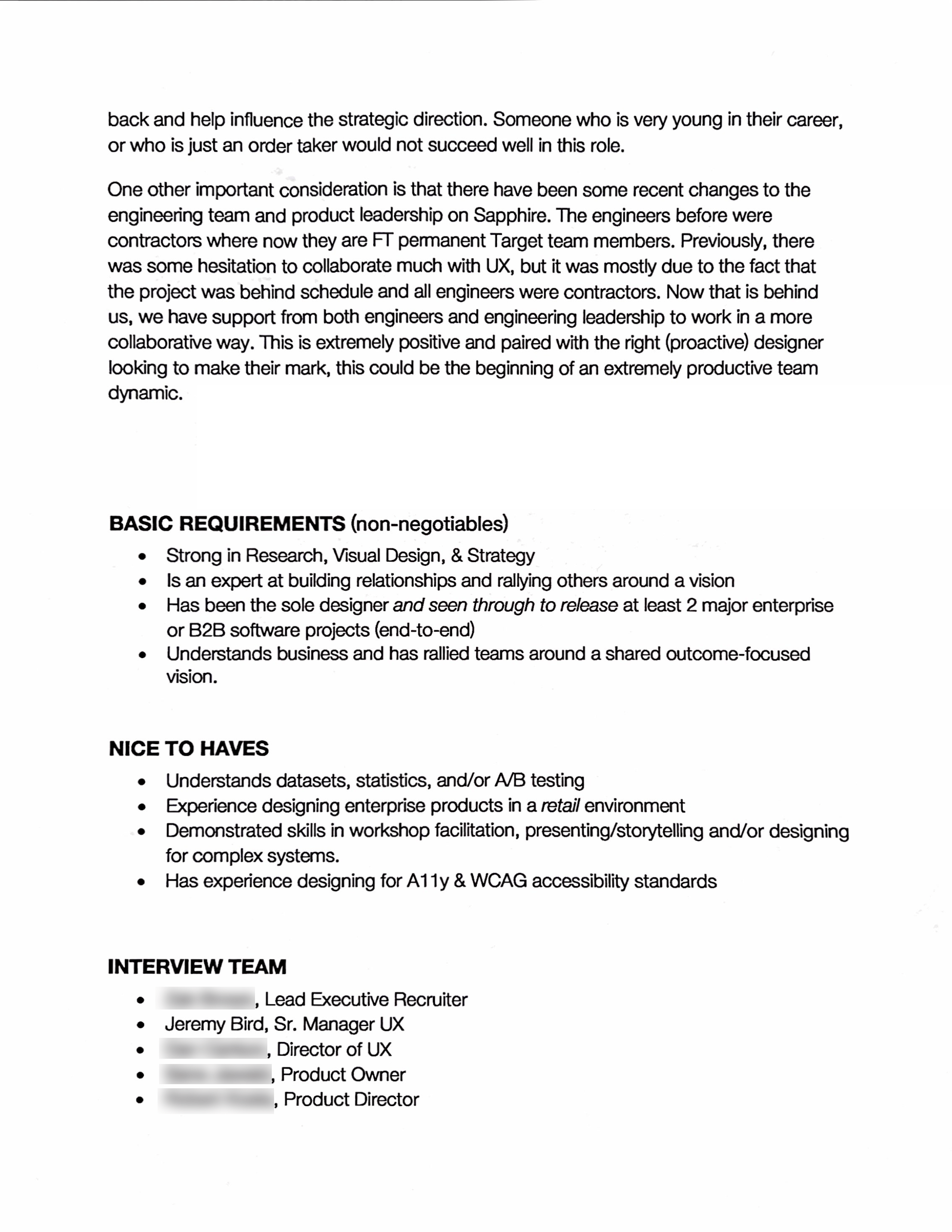
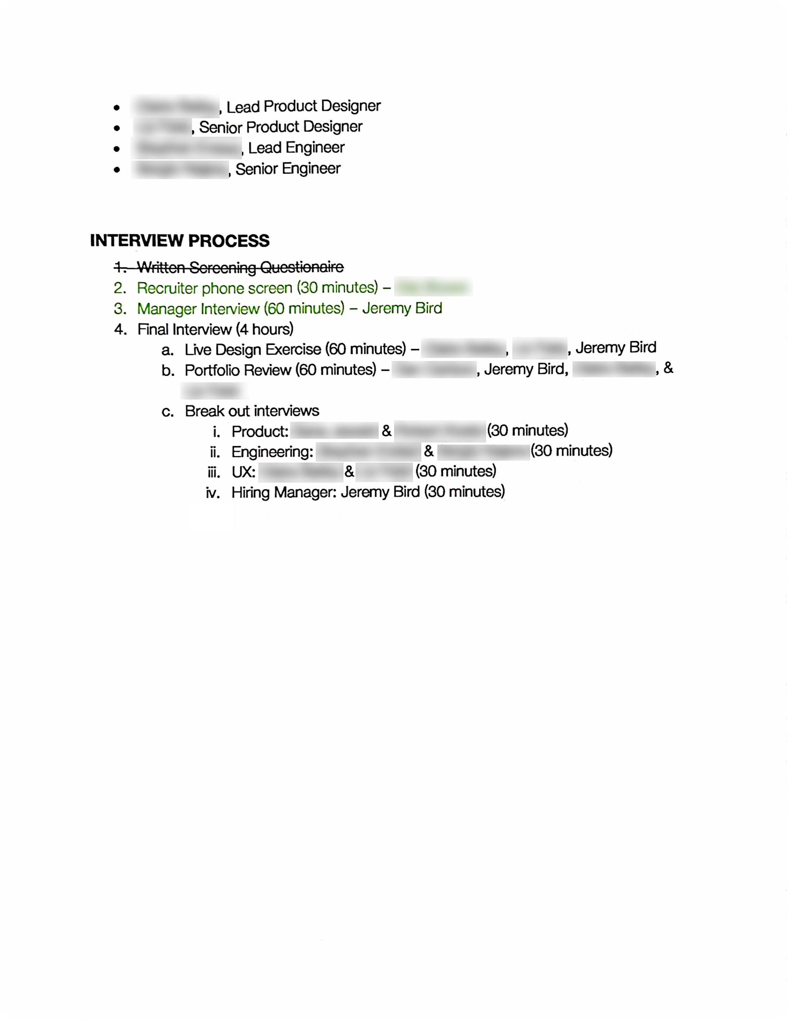
2. I partnered with recruiting to design a hiring process that would attract someone with the right skillset to achieve the objectives this team needed.
I took the time to partner with the Sapphire team and our stakeholders to identify the main objectives we needed someone to solve, and which Craft & Professional skills were needed to achieve them. I also documented cultural aspects of the team, and a proposed hiring process (with rubric) to attract & determine the right person. This was then refined with our talent acquisition partner. The goal here was to align stakeholders and provide valuable information to help our TA partner help us.
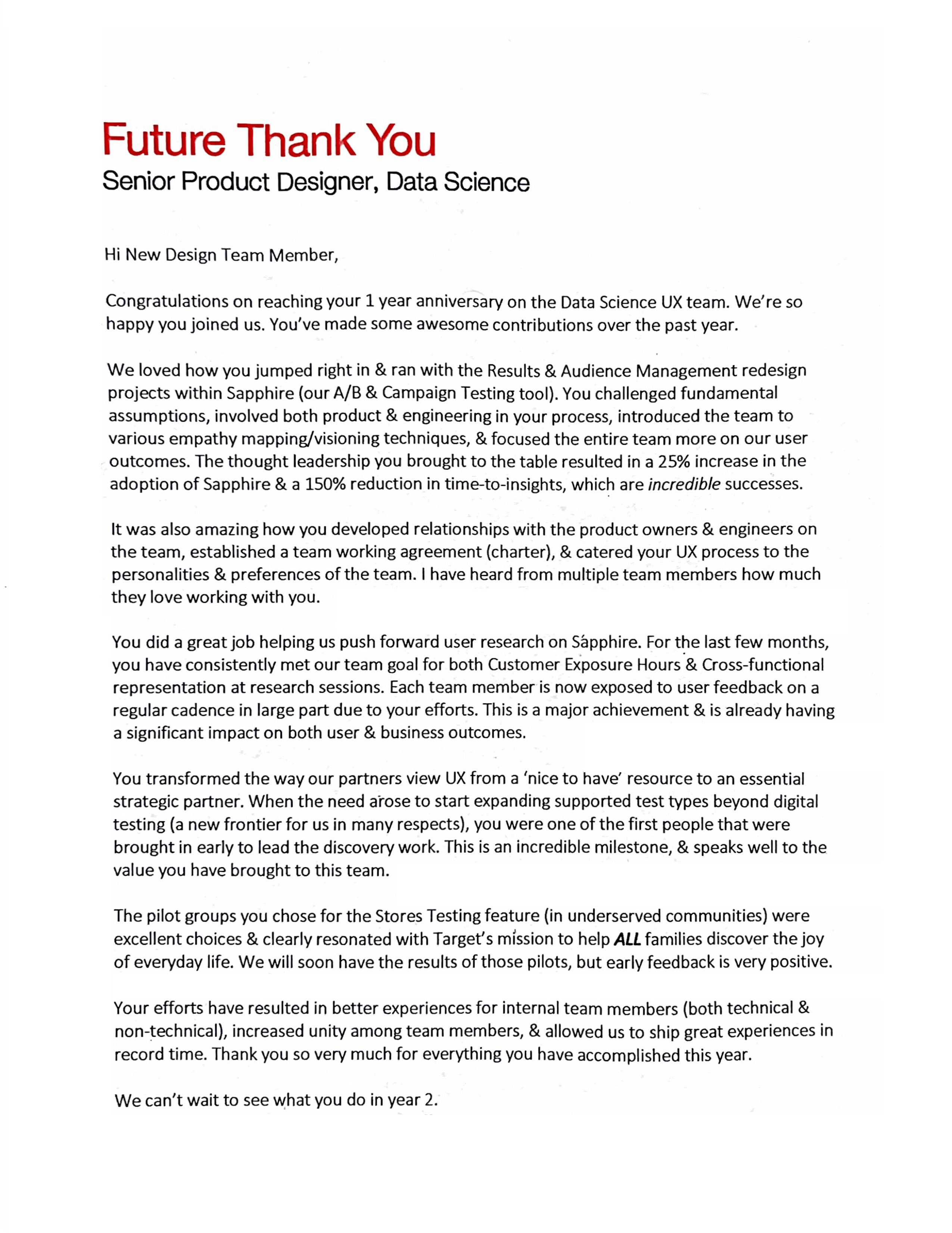
3. I wrote a "Future Thank You Letter" to clearly help our chosen interviewees envision what success would look like in the role.
This letter addressed what they'd be doing, how they'd have significant impact, and what objectives they'd solve in a way that helped them envision having already completed these things.
Stepping in to help with product designs while we were recruiting and onboarding the new designer.
Someone needed to help this MVP get across the finish line. Due to the concerns the team had with the previous designer, I decided to step in and help personally.
Because a lot of feedback had been received previously, and because the timeline was already quite far behind schedule, we focused on interaction design best practices and testing post beta launch. Following are some of the design decisions that were made to improve the usability and effectiveness of our users.
1. I designed a wizard to guide users through the test creation process that was both linear and dynamic.
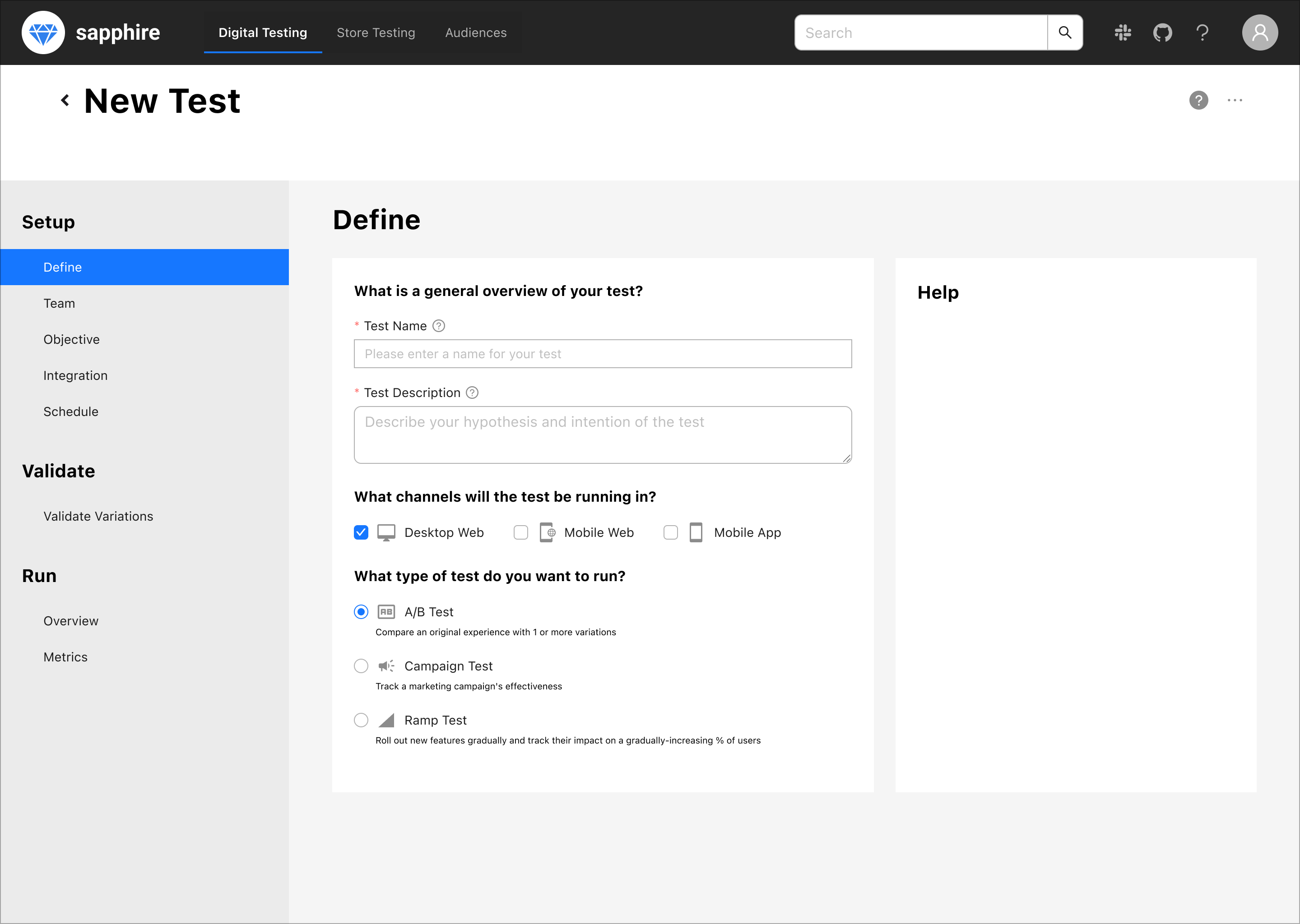
2. I Introduced visual hierarchy to help bring the most important content & actions forward.
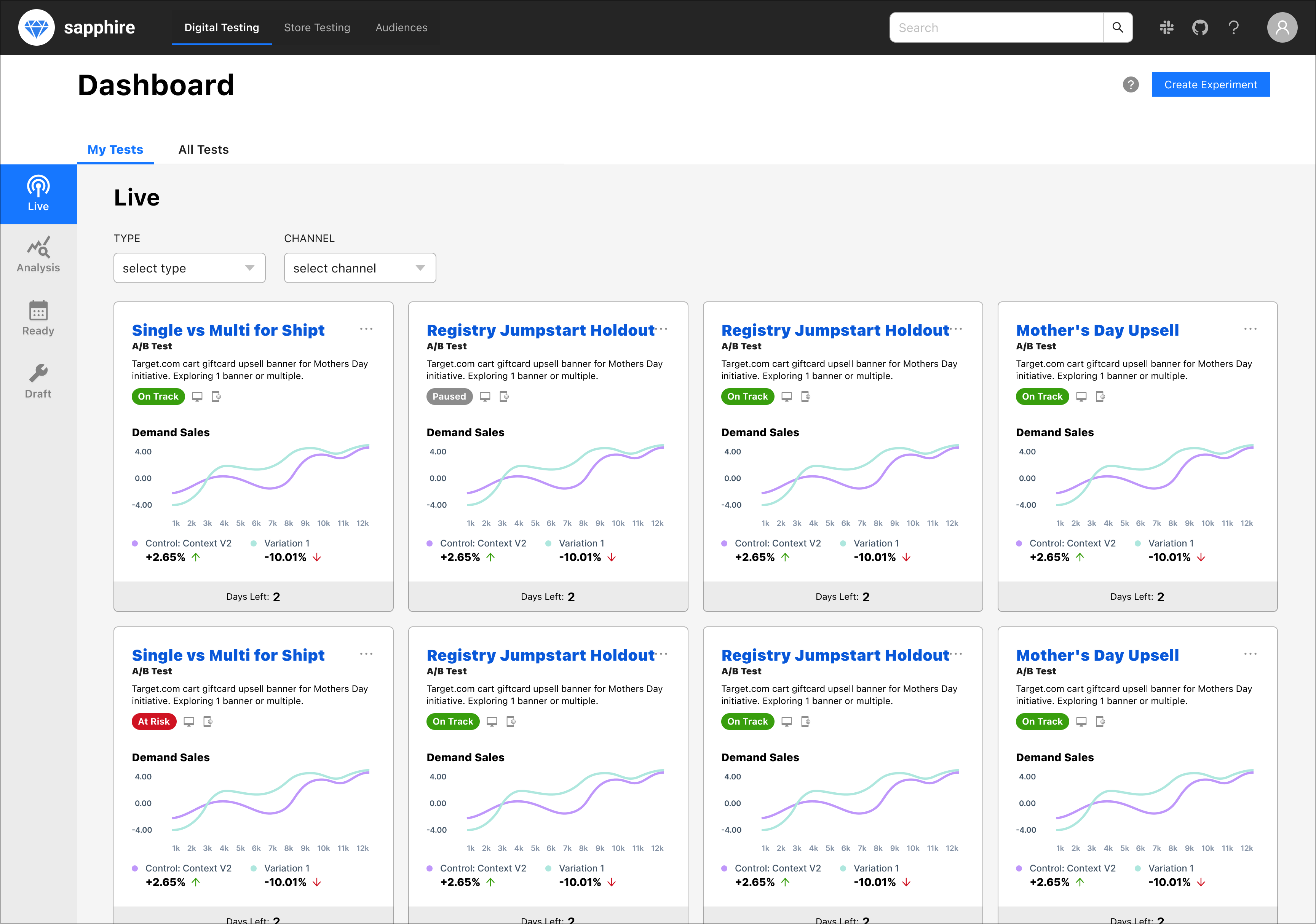
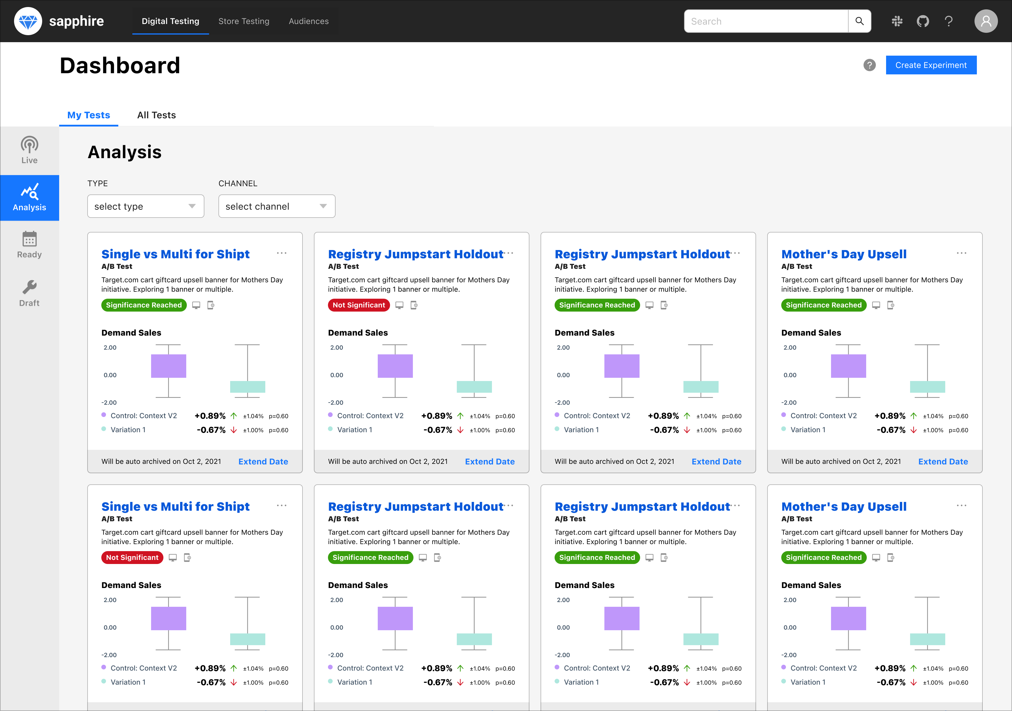
3. I added contextual awareness & stopped forcing users to leave the context of what they were accomplishing to perform actions.
RESULTS
The results were felt quickly:
56% reduction in test creation time.
Successfully hired & onboarded new hire that was a tremendously good fit for the team and who quickly gained their trust.
New hiring approach resulted in 67% reduction in hiring time (& generating solid leads for other teams)
"I noticed a distinct difference in the quality & experience of Sapphire the day Jeremy started being involved in the work."
—Sapphire Engineering Director
"It's a much cleaner & simpler interface. The steps keep you focused and free from feeling overwhelmed."
—Analyst
"I can follow the wizard and create a test without any additional documentation"
—New User
"HUUUUUGE improvement over V1"
—Super User
© Copyright 2023 Jeremy Bird Design - All rights reserved.