Eliminated abismal app performance, usability nightmares, & intense frustration.
The "Omadi Towing" & "Omadi Mobile CRM" iOS & Android apps were losing customers due to performance & usability issues. Significant downtime was occurring which was resulting in lost revenue. Not only that, but every time a tow operator spends extra time trying to get their app to work on the side of the road, they place themselves in real danger. (More tow truck drivers die every year than all other first responders put together.)
This is the story of how my product thought leadership, ability to pivot quickly, and lean product development approach helped eliminate attrition, save our clients millions in revenue, and even save lives.
OBJECTIVE
The objective of this case study is not to provide a chronological list of all events that occurred during this project. Let's face it, you don't have time to read that. (If you would like, I'm happy to present a more in-depth version of this case study in an interview).
This case study's objective is to showcase my following 3 strengths:
1. Business Strategy Thought Leadership
2. Ability to Pivot Quickly (based on business & user needs)
3. Lean, outcome-focused, approach to value-delivery.
SUMMARY
There was no way to 'fix' our mobile app without revamping it.
As mentioned above, our existing native mobile apps were contributing largely to downtime, lost revenue, and increased danger to our clients' tow operators. The main goal of this project was to help tow operators complete tows quicker, with less frustration and danger.
As we started doing discovery, we realized that there were 3 major pain points that we had to overcome to be able to meet our goal:
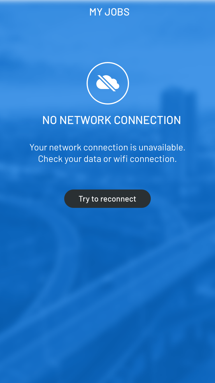
Sync & Performance Issues - long sync times/load times cause by enormous configurable forms from the desktop CRM and immense photo upload times were causing not only wasted time but also frequent app crashes.
Extreme Configurability - while initially viewed as a strength, the extreme configurability of the platform was leading to inconsistency and massive forms which then had to be synced to the mobile app (even though 90% of the fields being synced were irrelevant to a tow driver.
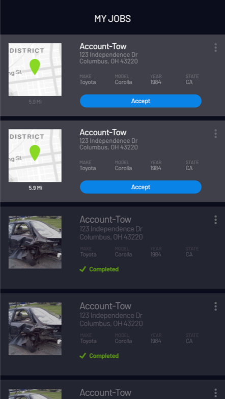
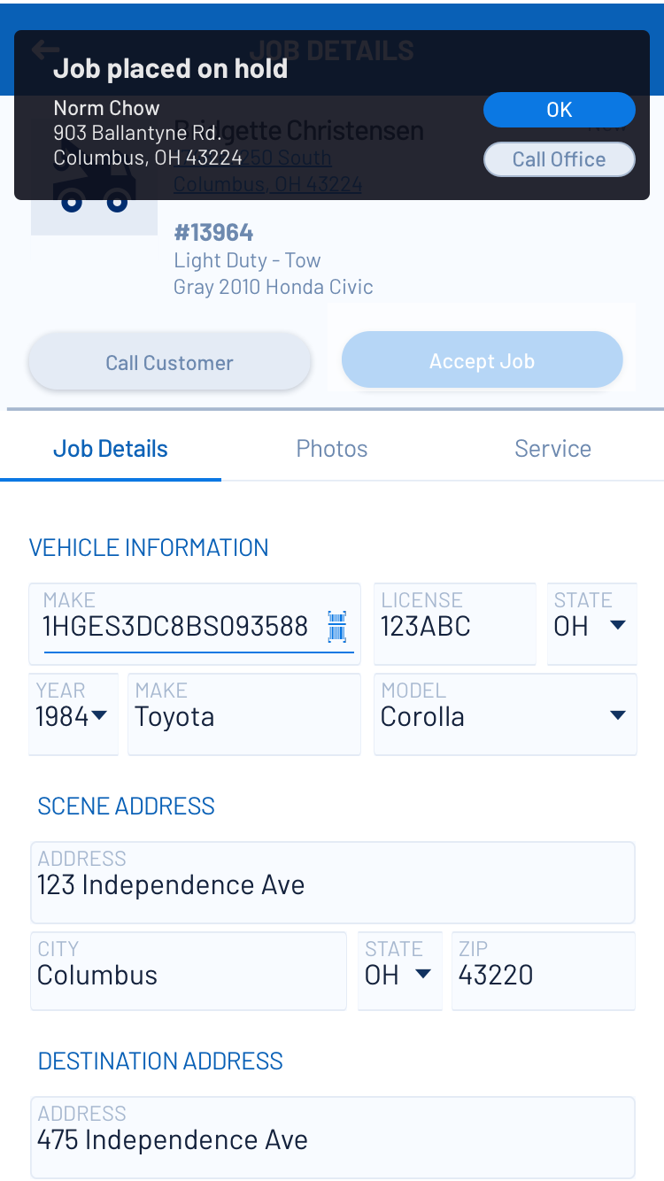
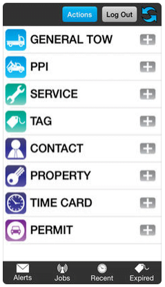
Usability Problems - having never had a UX team before I started, Omadi's apps had glaring usability issues all over. Hunting through immense forms to find relevant information, a laborious photo capture/upload process, and 7 clicks to perform the most common action are just 3 examples.
BUSINESS STRATEGY & THOUGHT LEADERSHIP
Solving the problem, not just implementing the requested solution.
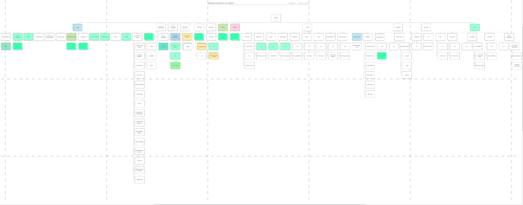
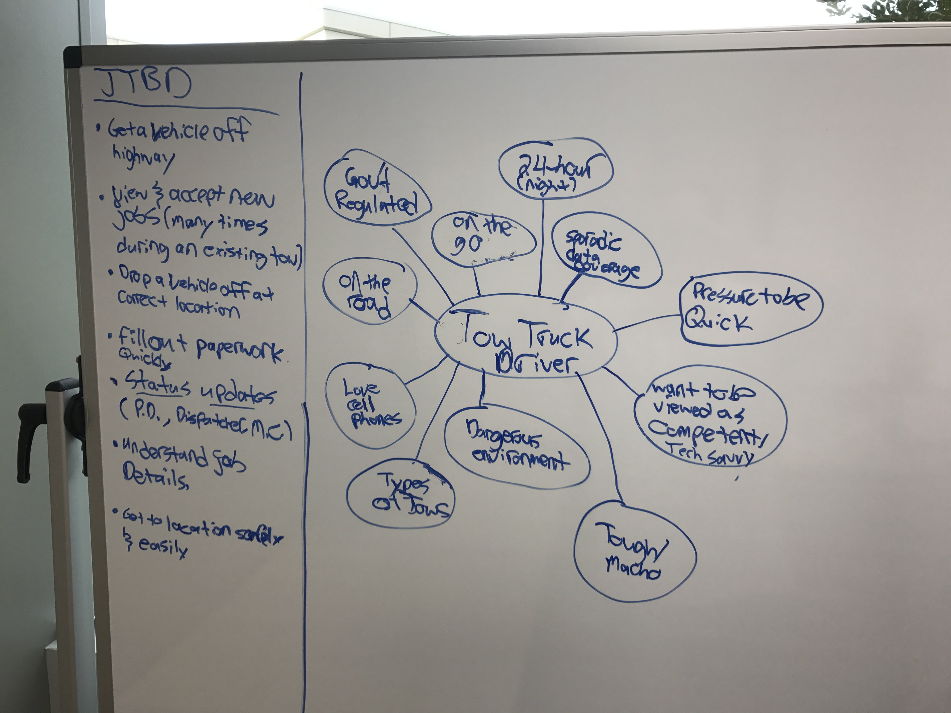
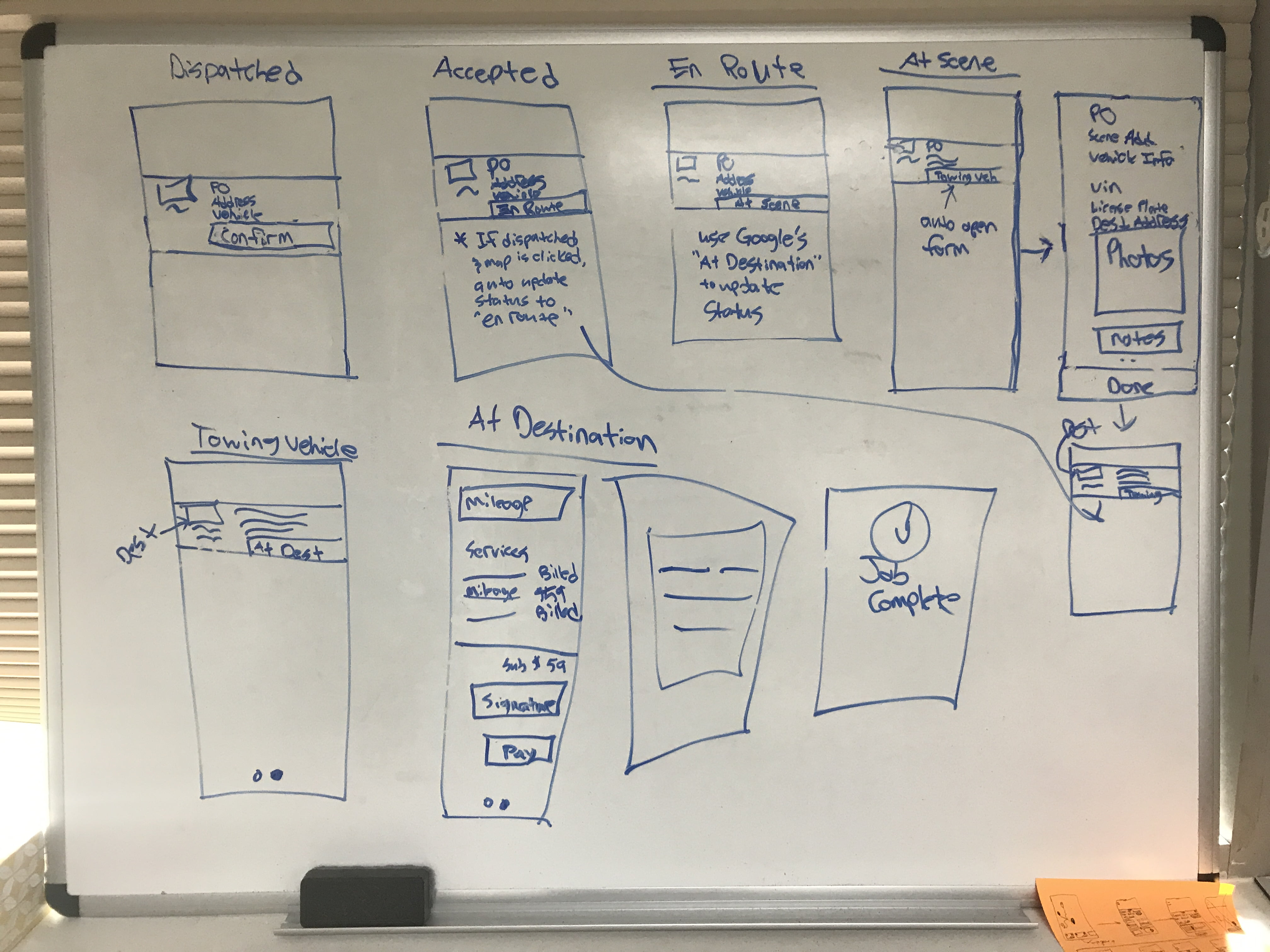
In order to solve some of the deep rooted problems we were experiencing, I had to step up and help guide the business strategy. This involved not only getting to know our users and the business, but in helping to shift the business from a "we help everyone do whatever they want" mindset to a "we our the thought leaders in the towing industry, let us help you increase your revenue and be more efficient" mindset. Through contextual inquiry & observation research, user interviews, information architecture mapping, and mapping out the user flows I was able to show business leaders that intense customization was a weakness not a strength.
My thought leadership led to at least 3 major wins for our customers: Form Standardization & Simplification, Workflow Consistency, & Elimination of Non-essential Tasks.
Form Simplification
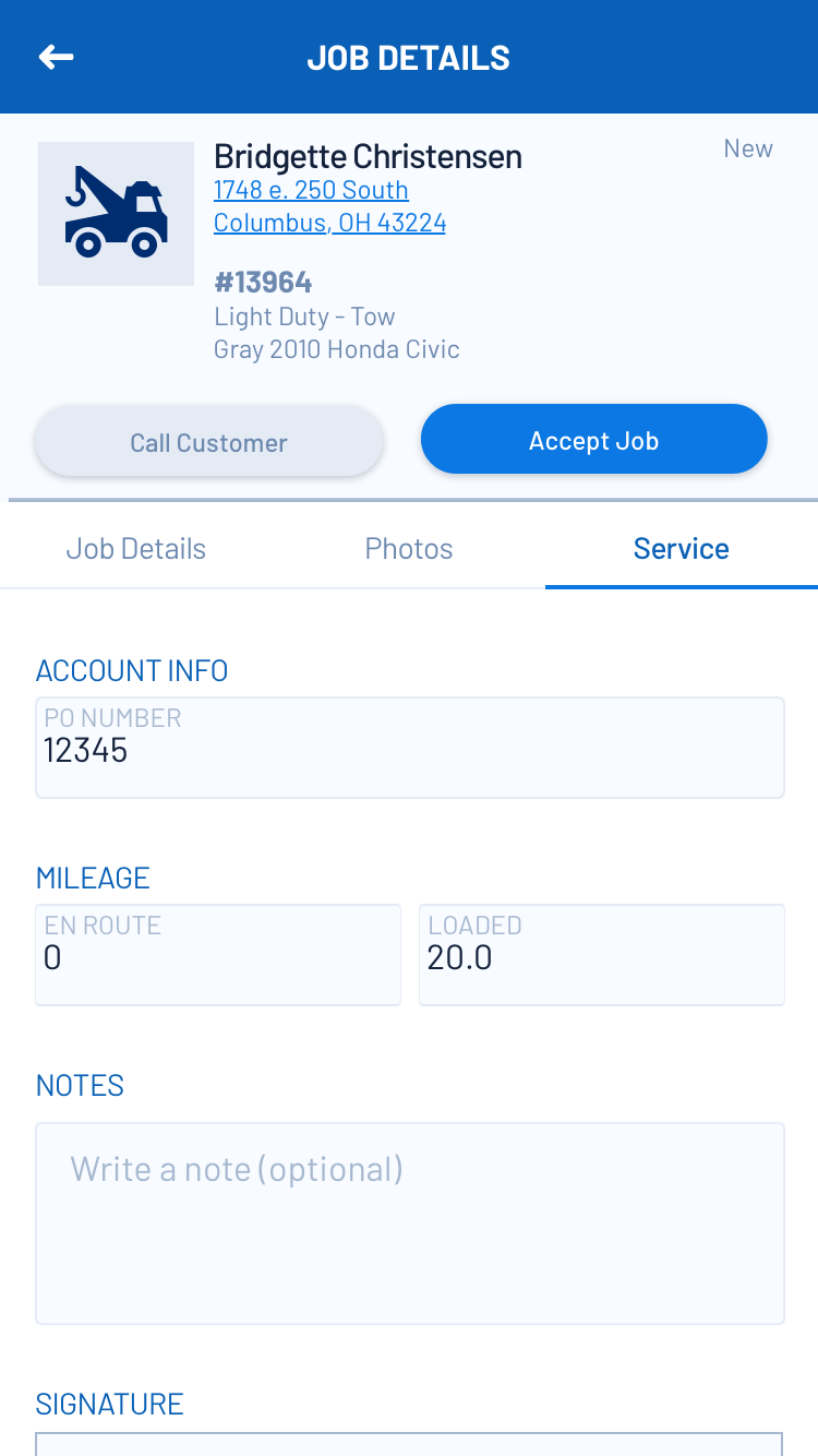
The first glaringly obvious problem to me as I started the discovery process was how large the forms that were being synced down to the mobile app were. Yet I knew from stakeholder interviews that we touted ourselves on being able to provide an immense amount of configurability to our customers. This included being able to access anything from anywhere (thus the full desktop form on mobile). One other major problem was that the ENTIRE form with all the billing/dispatching/auditing fields was being pushed down and synced to the mobile app. A tow driver only needed 7% of the fields that were being synced between web & mobile.
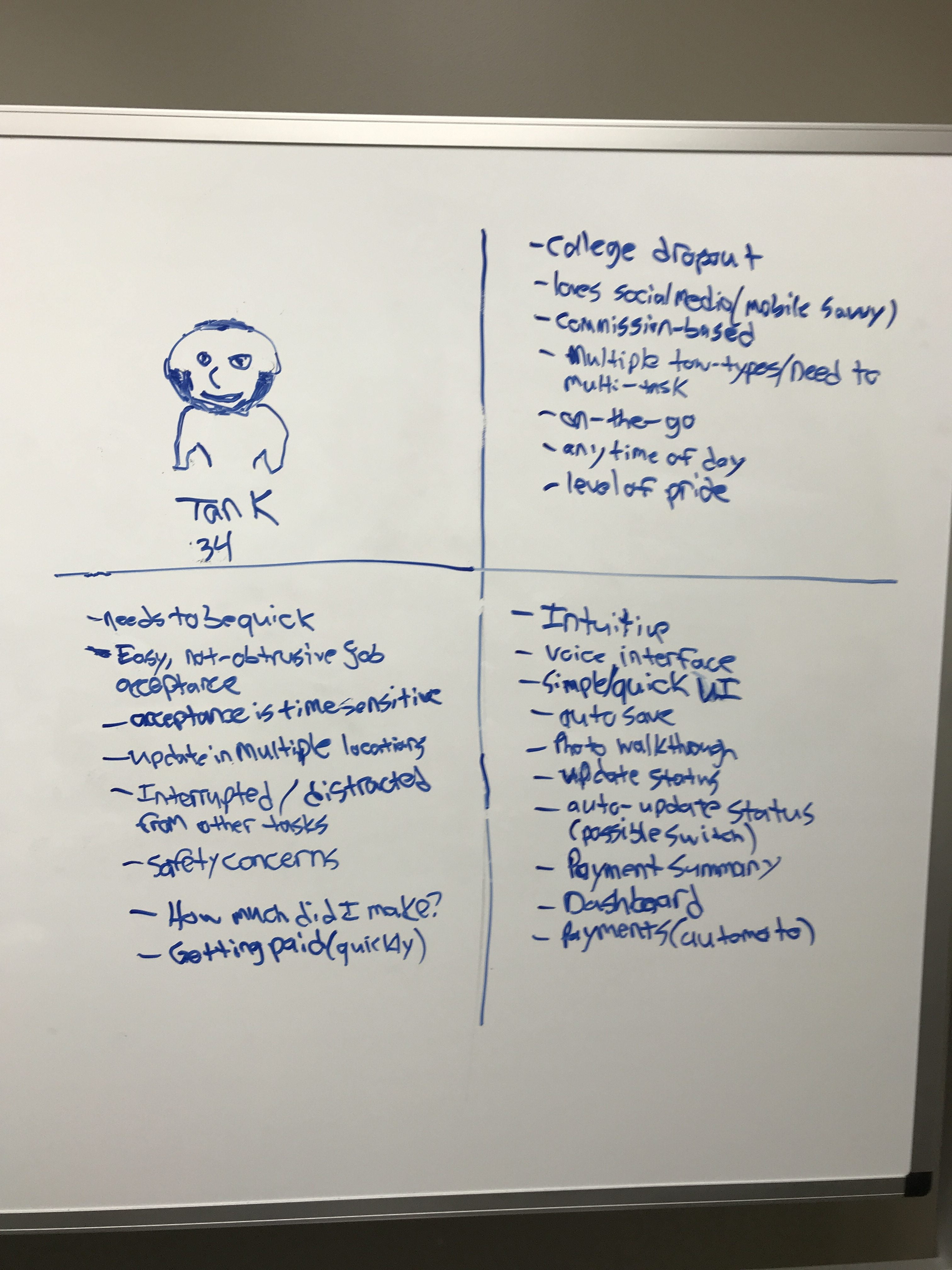
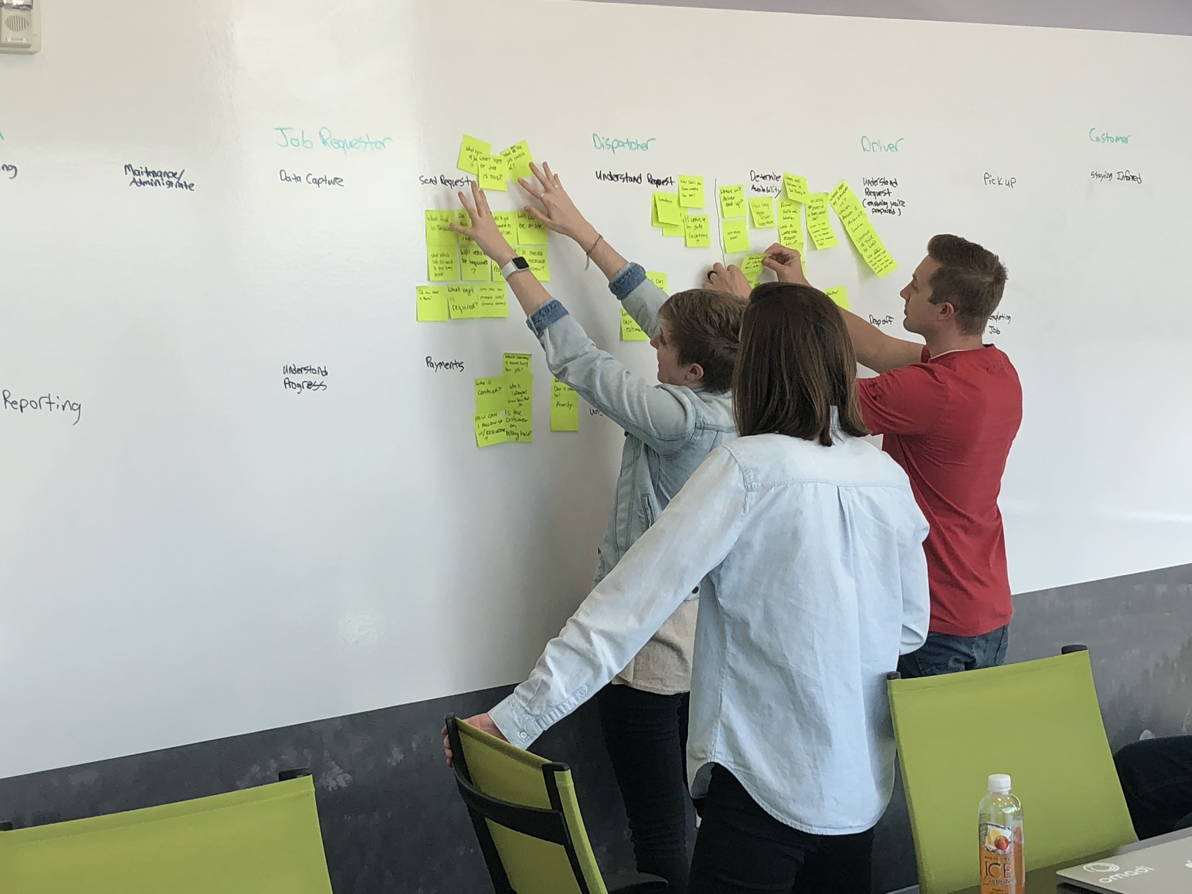
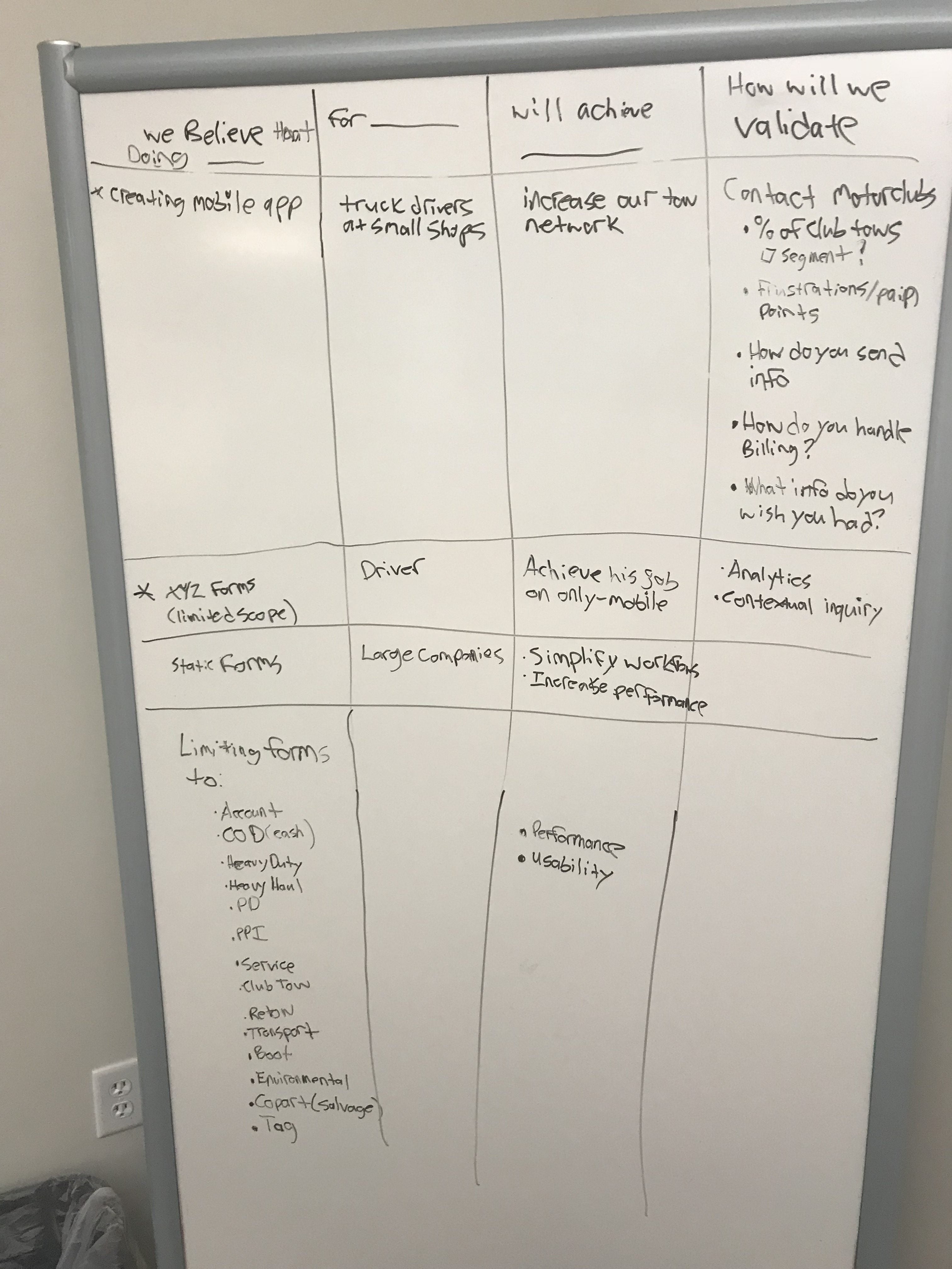
Using proto personas, affinity mapping, listing out assumptions in hypothesis statements, & then validating those hypothesis with contextual inquiry & observation (both my own and helping guide the validation of our senior leaders) I was able to:
Get buyoff on pivoting our business model from "we help you run your business however you want" to "we are the thought leaders of the industry, let us help you increase your revenue and make your business more profitable".
Identify set of form fields that would work across all existing job types and that were all relevant to a driver (reduction of 79%).
Workflow Consistency
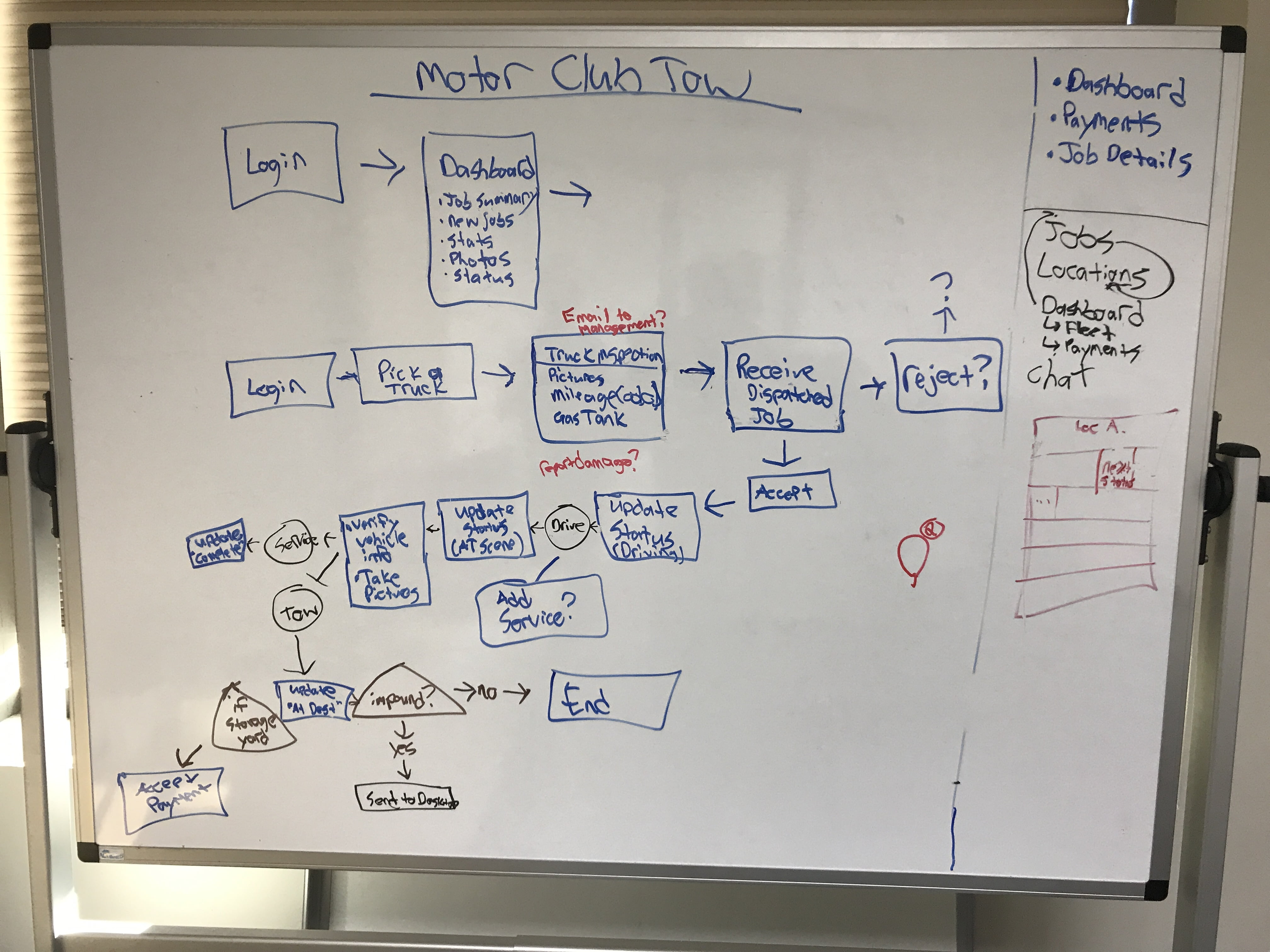
Just standardizing forms was not enough, though. Due to the customization of the forms the workflows between a general tow & motor club tow were quite different. This was due to the fact that billing differs quite significantly. A driver doesn't care about billing though. What I discovered from my research was that to a tow truck driver, there really is little difference between job types. Through my research and mapping out the driver's experience, I was able to clearly identify a workflow that worked across all towing job types. This workflow held true even when new job types were added that had not previously been supported (such as battery delivery & salvage towing).
Elimination of Non-essential Tasks
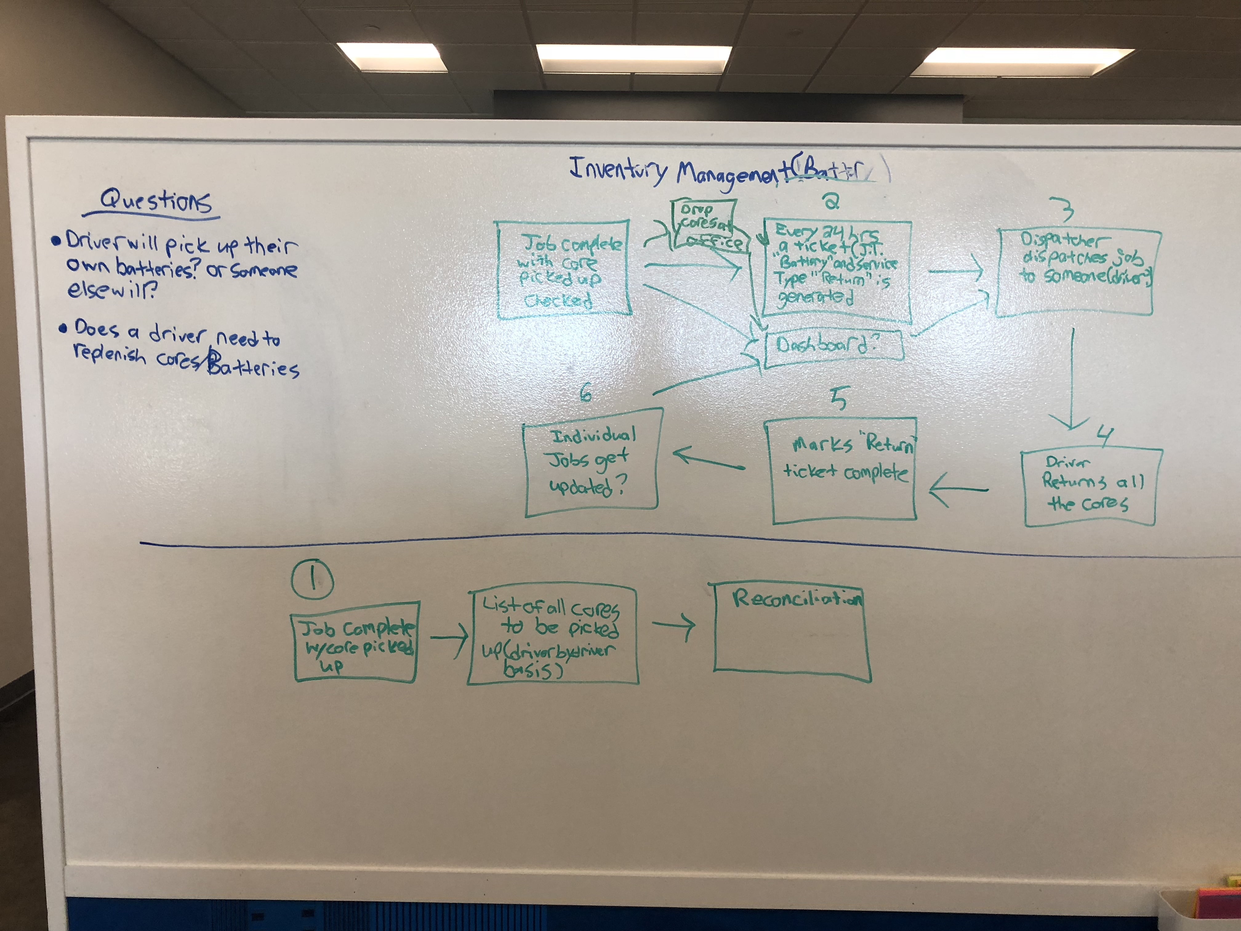
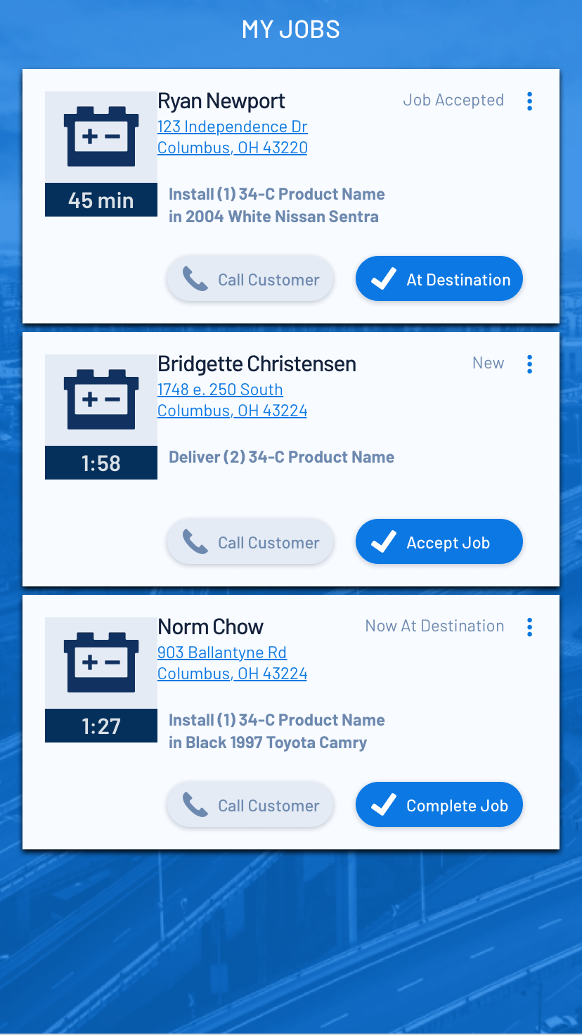
When this project when through one of many pivots (more on that in the next section), we ended up working with a partner to build out a salvage job type into the Driver app. This partner needed our help picking up totaled vehicles and dropping them off at a salvage yard to be sold. To enable that workflow, my team and I were asked to pivot and focus on the salvage workflow before finishing & releasing towing. The goal was to help this client increase the number of same day pick ups.
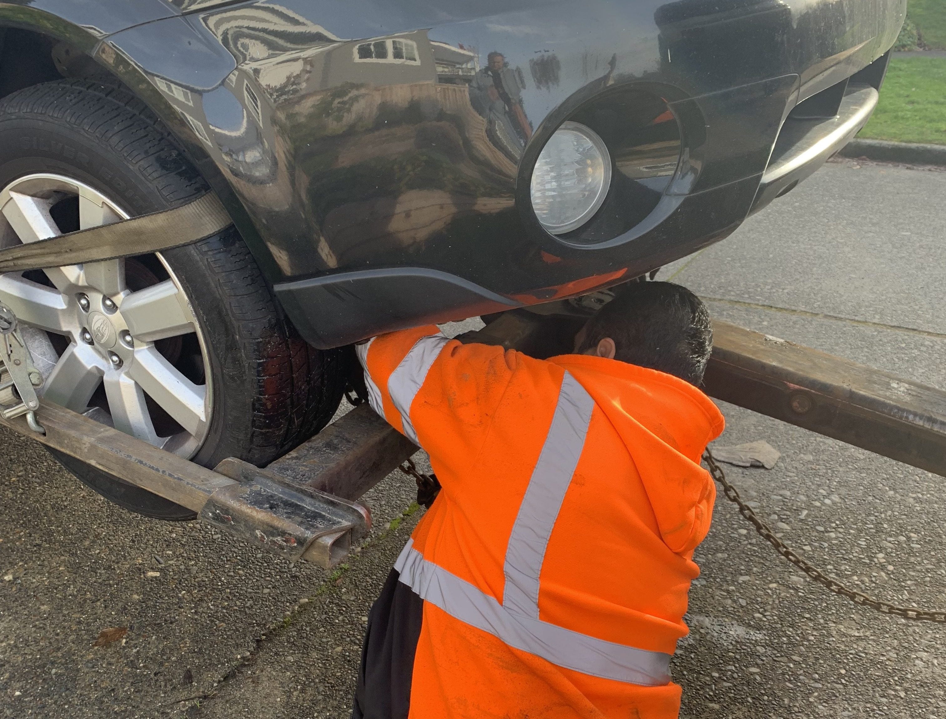
What I found upon doing ride alongs with tow truck drivers in the salvage space was that they were being expected to complete an inventory on vehicles before picking them up. This accounted for the vast majority of the loading time of each vehicle (about 5 minutes). This was fine, except when I realized that ANOTHER inventory was being done by the tow yard workers upon receiving the vehicle. Also, making the driver do the inventory resulted in some incorrect information getting recorded.
Armed with knowledge from the ethnographic & contextual research I and my software architect coworker did, I was able to go to the business and our partner with a recommendation to allow photos to serve as evidence of the status of the vehicle before load instead of a 5-minute inventory done by the driver. We didn't eliminate all the inventory fields, but we reduced them from over 80 to 6 (the other 7 fields were non-inventory related)!

ABILITY TO PIVOT QUICKY
Flexibility and agility were key to helping this project succeed.
During work on the new Driver app, my team and I had to pivot many different times. This required flexibility, patience, and an ability to understand the business priorities. As a product team, we also deliberately pivoted based on user needs and new learnings. There were 3 main types of pivots that occurred: pivots in job type, pivots in Information Architecture strategy, & pivots in interactions.
Pivots in Job Type
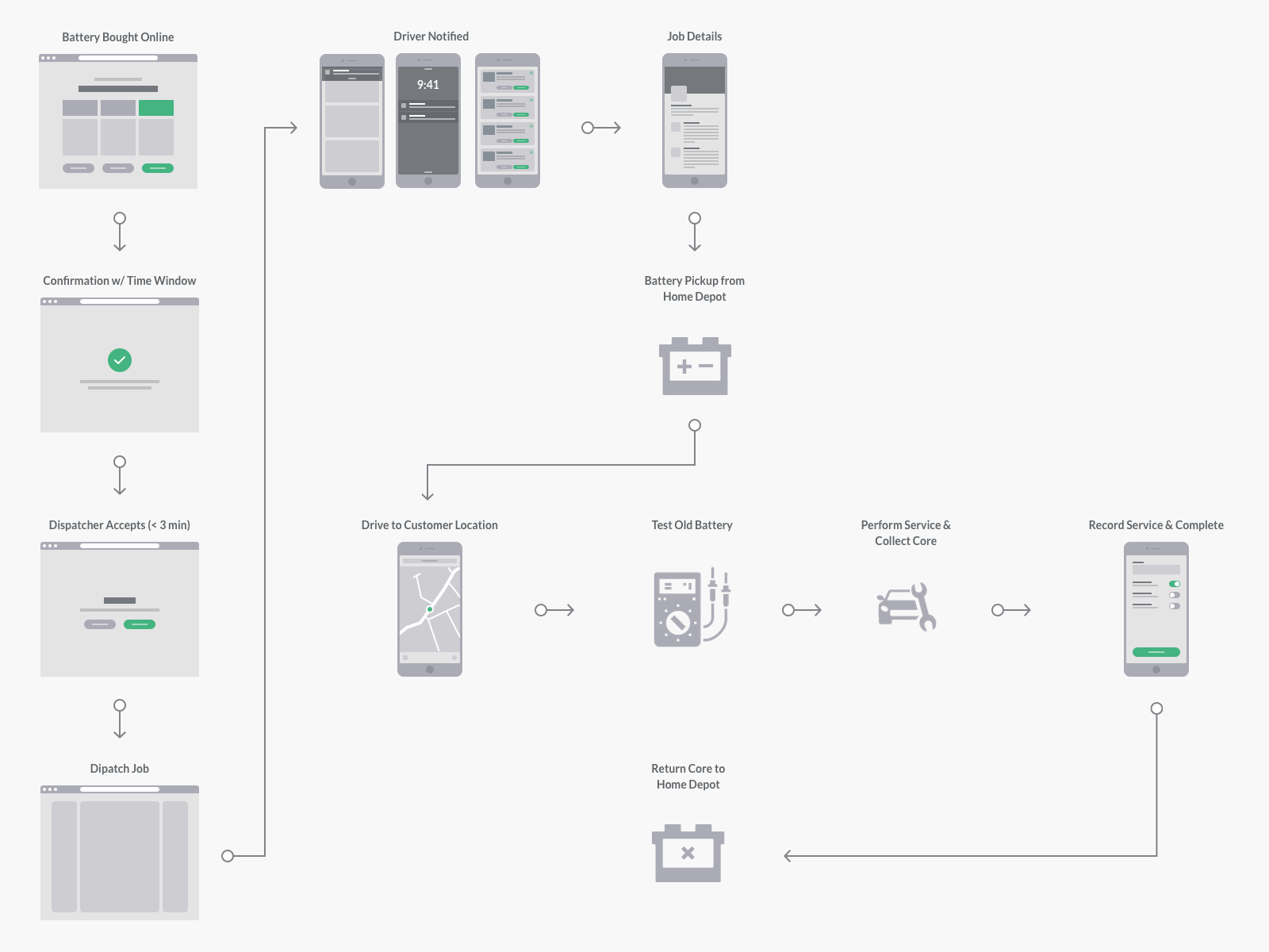
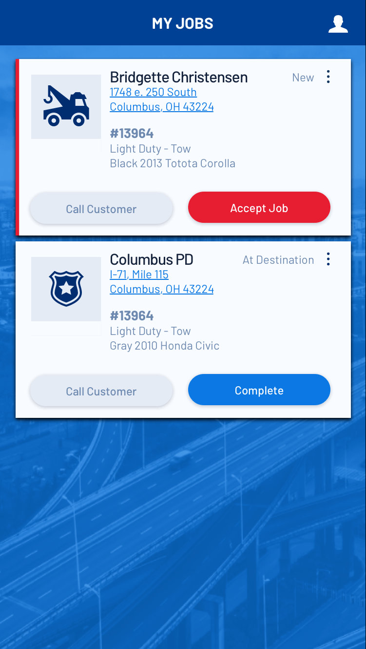
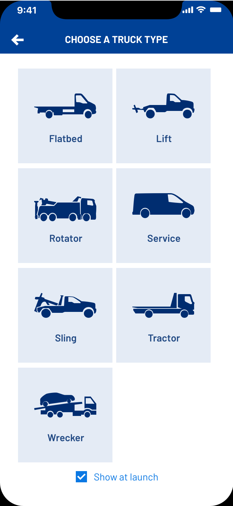
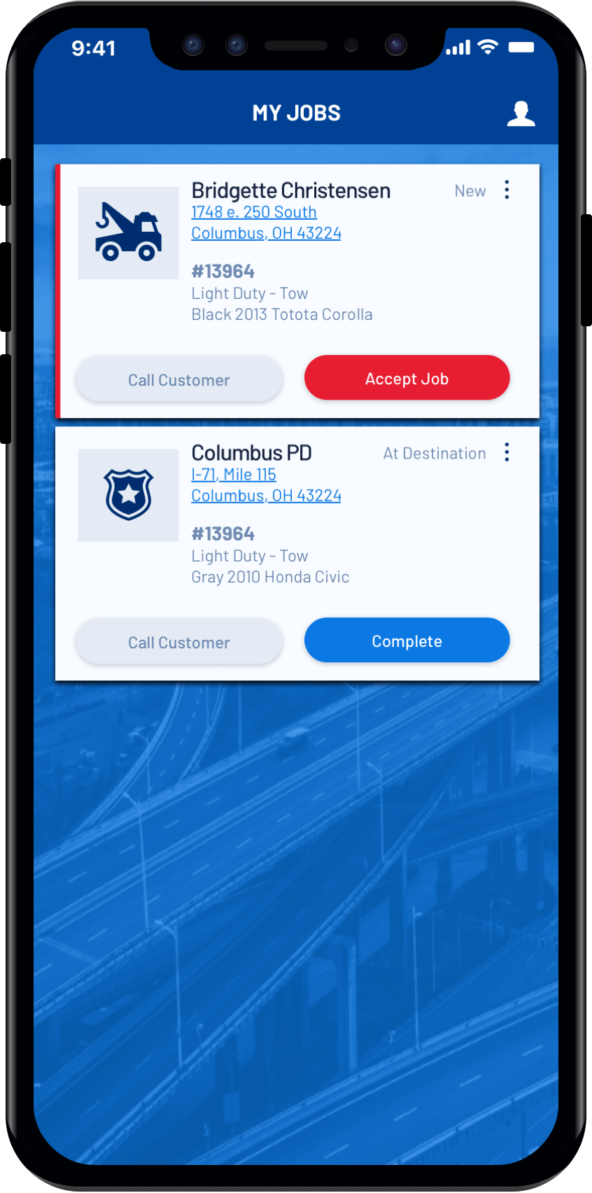
I was initially assigned to focus on Motorclub tows since that was the most complex and the thinking was if we can make that simple, then everything else will fit in well. After doing research, discovery, design, and working with development in a very lean/collaborative way to build a functional front end prototype in only 6 weeks, I was asked to completely pivot to a brand new job type the company had never supported before (Battery Installations) due to a partnership deal that was signed. Then, when the app was ready to release, we had to pivot again due to the entire battery program being put on indefinite hold by our partner due to a complete leadership reorganization on their side. When we did get back onto focusing on towing, we pivoted from Motorclub tows to General and Police tows since those were the job types needed by a majority of our customers and management wanted to get as many customers off our legacy mobile app ASAP.
Through each pivot, we built on the learnings and iterations of the previous version. The other thing that saved me from a design perspective was that when doing discovery and brainstorming I was considering multiple job types when designing IA and user flows since the eventual goal was to support all job types in a single app and I wanted the experience to feel integrated.
Pivots in Information Architecture
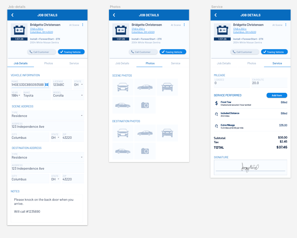
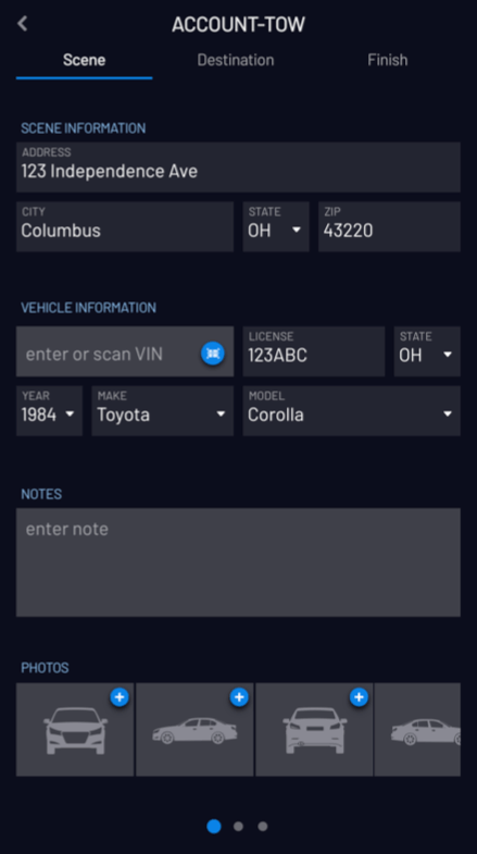
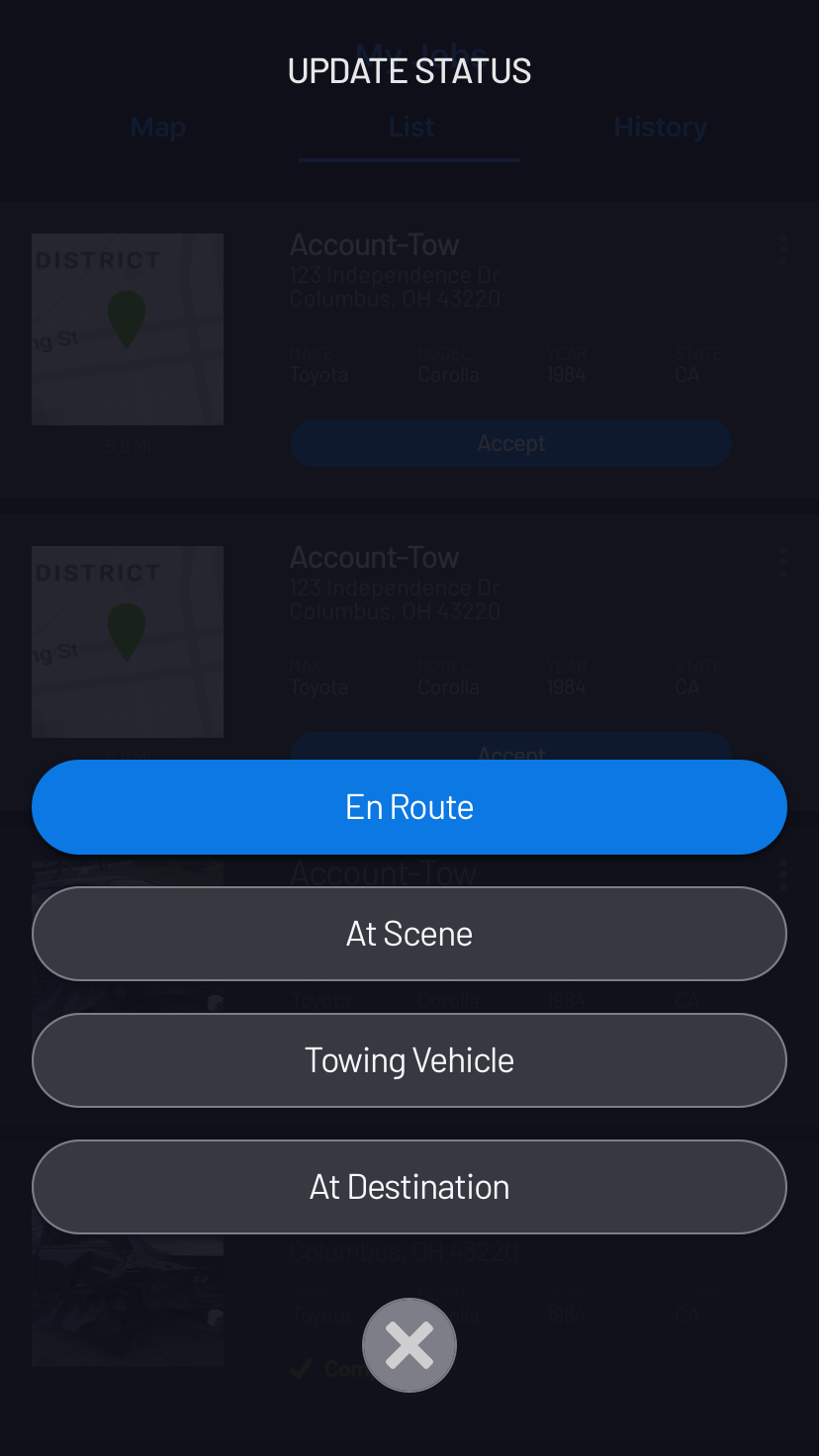
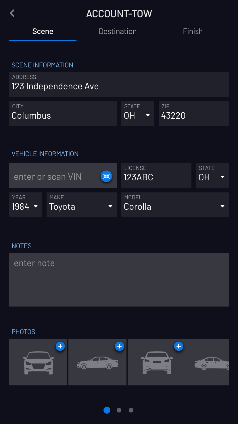
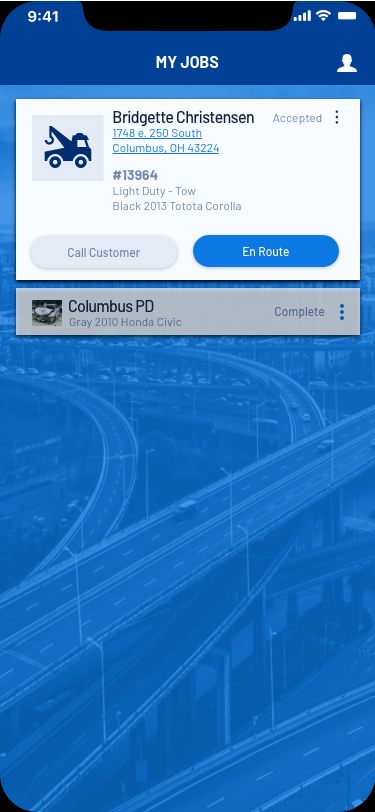
The design strategy I chose to solve many of the business and user problems described above was context-aware design. That is, give users the information they need, when they need it and get everything else out of the way (but still accessible). For this reason, I chose to organize the job details and data entry fields according to the user journey. There were 3 main sections: At Scene, At Destination, and Finish. This resonated with internal stakeholders and our initial user testing participants as well.
What we found, however, as we started pivoting from job type to job type was that the order in which fields were filled out varied somewhat with job type. For example, on a police tow there was immense pressure to get that vehicle out of there so the police could unblock the roadway. There was no time to be fiddling with an app. On other tows, though, drivers wanted to take photos at the scene to protect themselves. The process also varied from company to company.
We also observed that many users were confused by the similarity between the Scene and Destination forms. The addresses for example were different, but showing the vehicle details on both pages made the addresses confusing as well.
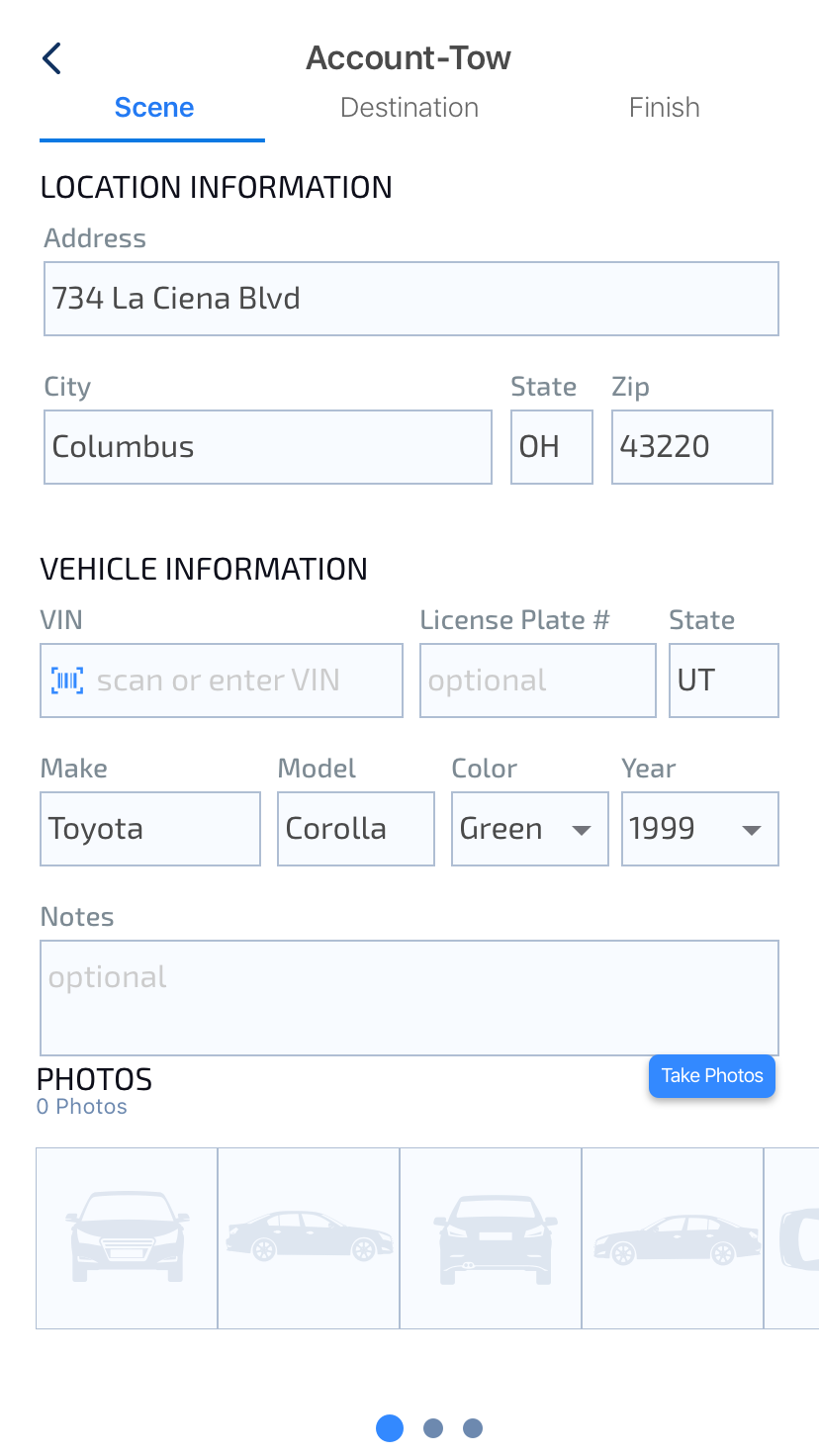
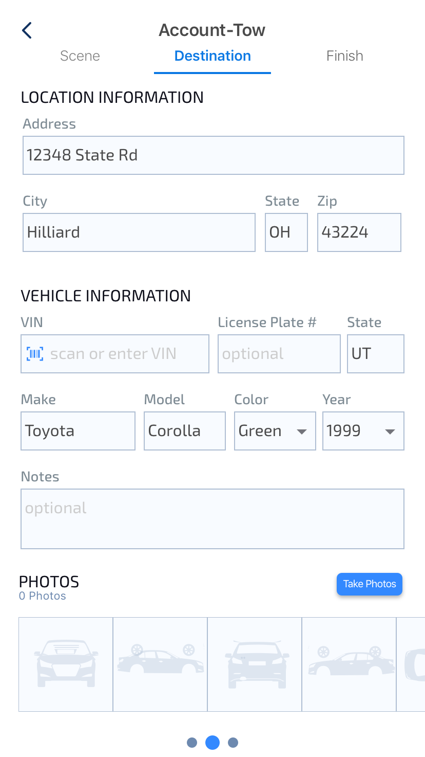
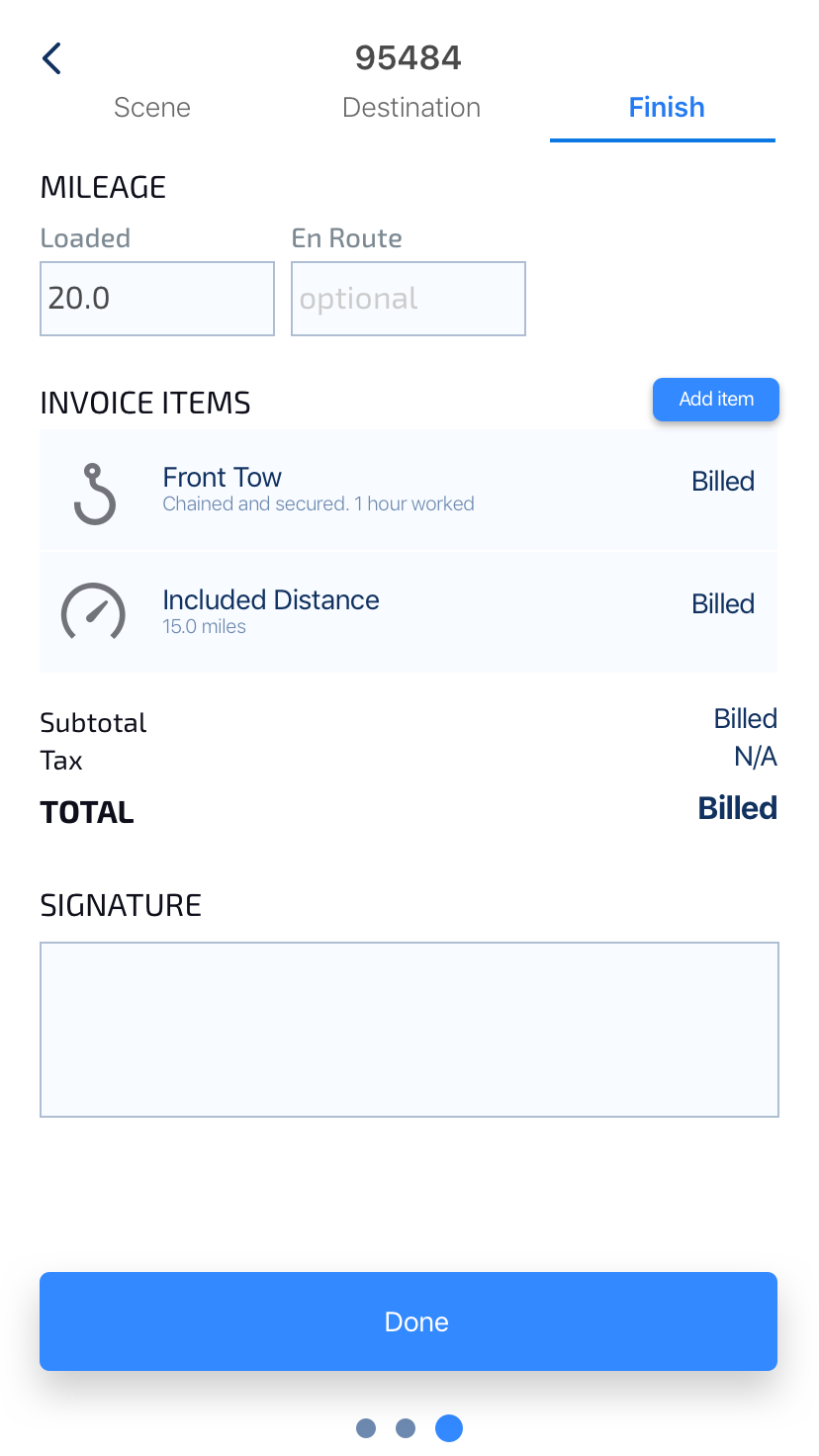
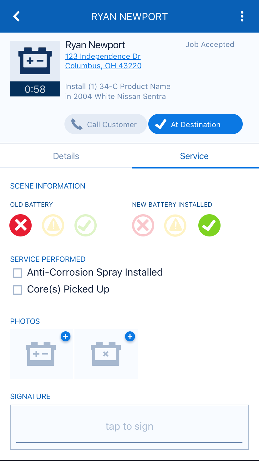
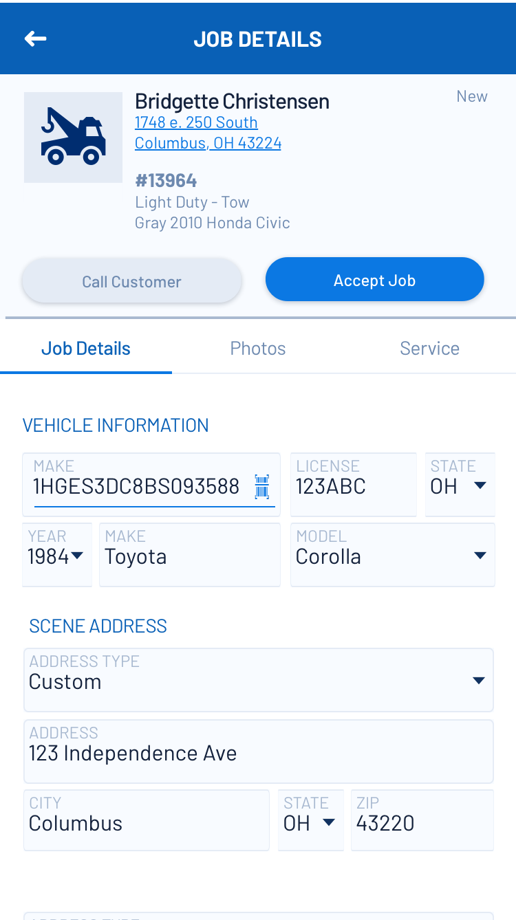
So instead, I made the fields easy to find instead of trying to match a particular workflow. This approach also allowed for separating the photos onto their own page, which made things much more clear and better matched users' mental model.
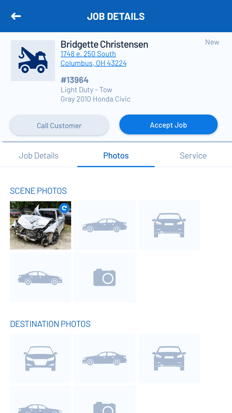

Pivots in Interactions: Photos
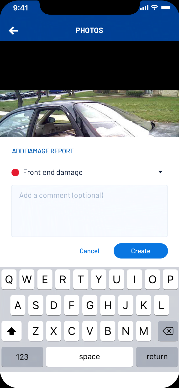
Many of the glaring paint points that existed in the legacy app stemmed from the burdensome way photos worked. Each photo had to be uploaded individually before another photo could be taken or another field updated. There also was no down sampling or limit on photo size which was compounded by the fact that very often the app was being used in low-bandwidth areas. This caused the app to be unuseable.
Another frustration was the fact that there was no camera available inside the app. Photos had to be taken with the phone's camera app and then uploaded to our app. Also if you had 5 photos attached to a job and wanted to view those photos there was no way in the photo viewer to scroll between the photos. You had to enter the viewer, exit, and the enter again by tapping a different photo. Horrendous!
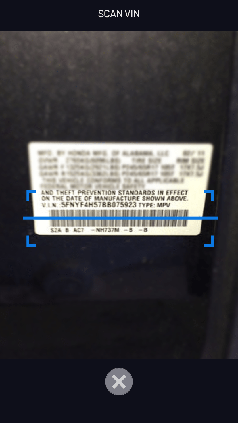
So needless to say, Photos was a big focus. I wanted to surface a camera inside the app, streamline the workflow and allow drivers to take all 5 photos required on a job without leaving the camera, and integrate the camera/viewer seamlessly. This led me to the idea of placeholder images that automatically advanced when a photo was snapped. So the driver could walk around a vehicle taking all 5 photos simply by tapping the shutter button 5 times in succession. The viewer and camera were seamlessly integrated and built around the placeholders so you could swipe back to view any existing photos, if no photo existed for that spot then you got the camera.
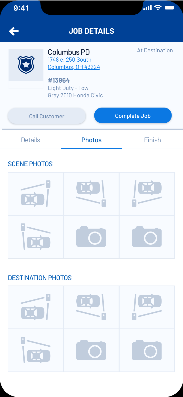
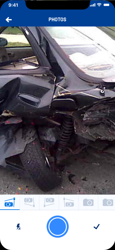
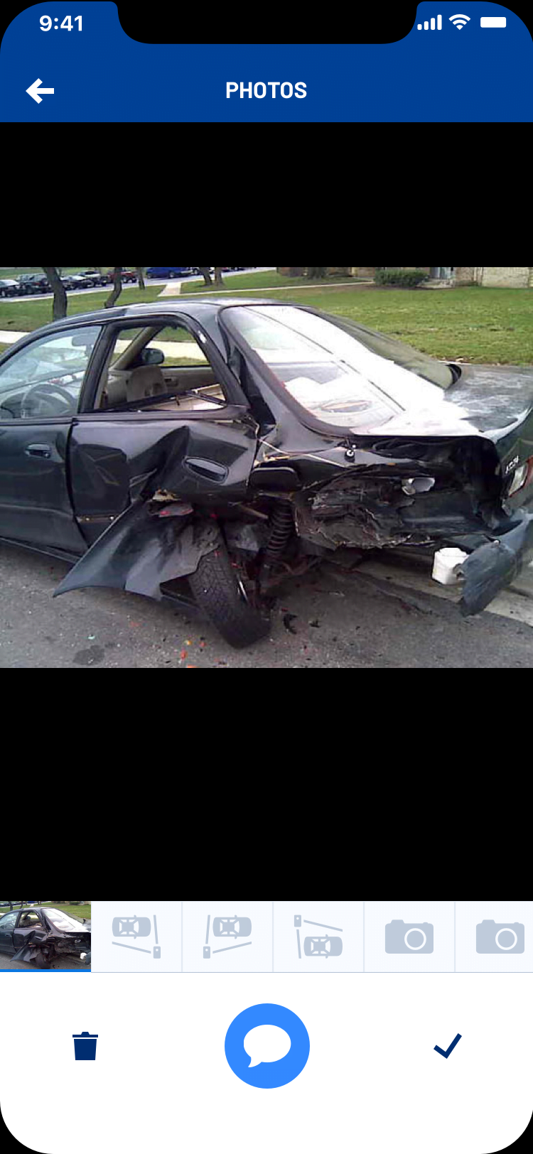
Upon testing the app in the field, however, we learned that this approach didn't work in the real world. This flow worked in certain circumstances, but it felt restrictive to many users. So we redesigned the photos feature to not be tied to placeholders.
LEAN, OUTCOME-FOCUSED APPROACH TO VALUE DELIVERY
Deliver value in weeks not months
One of my biggest contributions to Omadi in general was the thought leadership I brought around Lean UX principles and an intense passion for outcome-based design & development practices. I evangelized the principles and started using lean terminology, but mostly I started working in a Lean way and the product managers and engineers followed me. It helped that my boss (Director of Product Management) was fully supportive of lean from the beginning.
On this particular project, I demonstrated this lean thought leadership in 3 ways: Cross-functional Problem Solving, Quick Iteration, and Learning-based Focus.
Cross-functional Problem Solving
One of the keys to getting a full app prototype out in 6 weeks was working and collaborating really closely as a cross-functional team. I worked with a product manager, and 2 front-end devs really closely (more devs, and others joined the project later on). We started out stating our assumptions, hypothesizing, and brainstorming together as a cross-functional team. We even whiteboarded a possible app framework together.
Quick Iteration
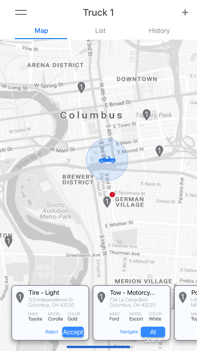
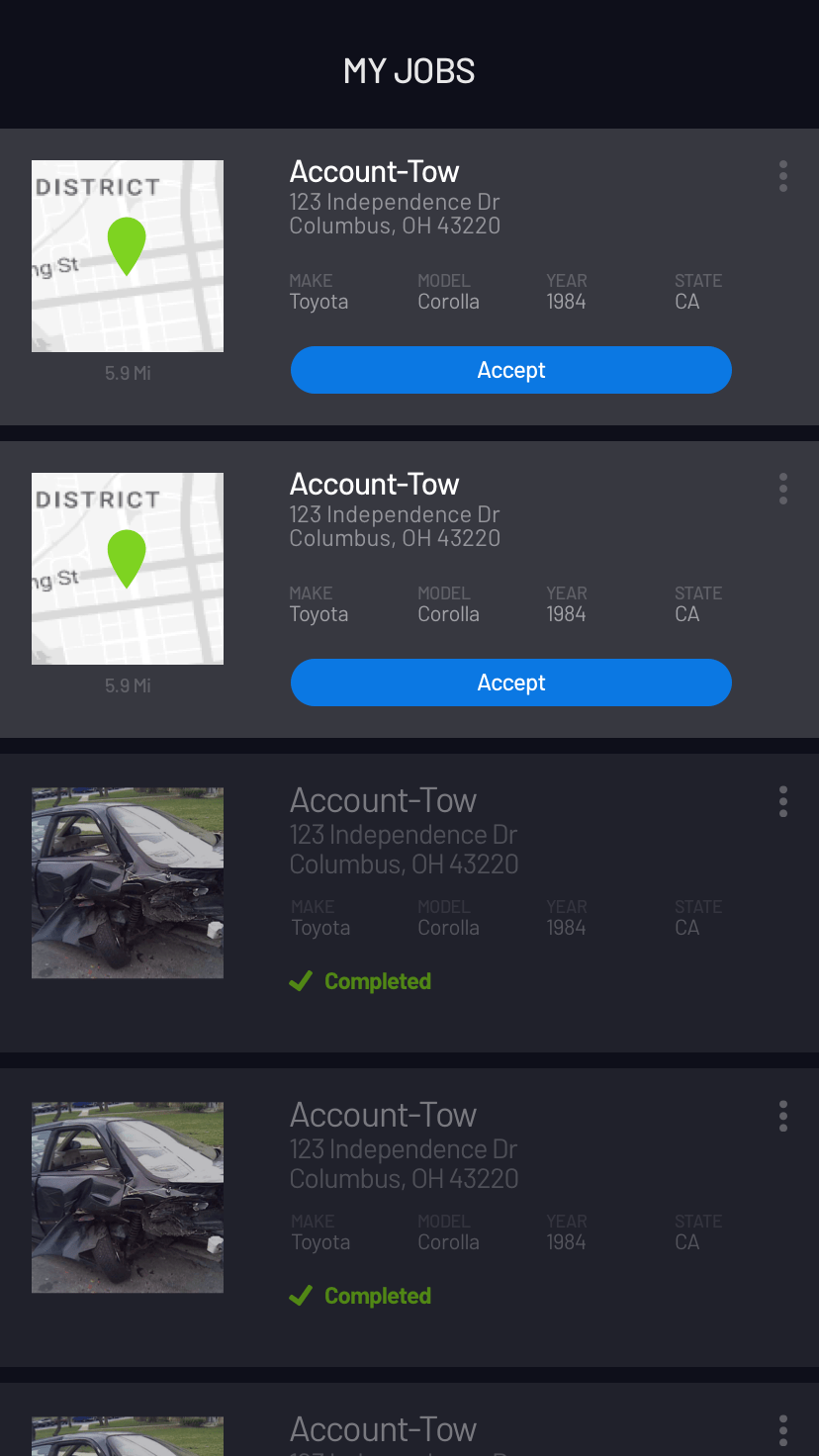
At that point, the developers started setting up the app framework using React Native and Expo while I started flushing out the interactions. We worked really closely together. We met at the end of every day to showcase the progress each side had made. The devs were about a day behind me. So as I came up with ideas and got them into wireframes, by the next day they had those designs into the app and we would go out and test them and iterate. In 6 weeks we had a full app prototyped out in React Native with a mocked back-end working this way that had been tested multiple times.
As the project progressed, and we kept moving forward, we kept in close contact eventually agreeing on a data contract with the back end dev team so we could keep making rapid progress while still allowing the back end to get built out correctly. As we pivoted and progressed, we kept in close contact and brought in support, training, and marketing as regular members of our team to help ensure success.
Learning-based Focus
Our focus all throughout this process was getting our ideas out of our head and into a form that it could be validated and tested with stakeholders and users. I created a company design review meeting called "Design Trust" where anyone in the company could come and give us feedback on our in progress work. This allowed us to get feedback and utlize the shared understanding of the company while still making rapid progress.
We also tested with users as often as we could. We got a lot of great feedback that helped us shape the product (as described above). The focus, though, was always on learning how we could solve the business and user problems more effectively, not on pushing out any 1 solution. Most of those who I was working with had never worked this way before, yet once I took the lead and just started working super collaboratively, they all followed and ended up really loving it.
